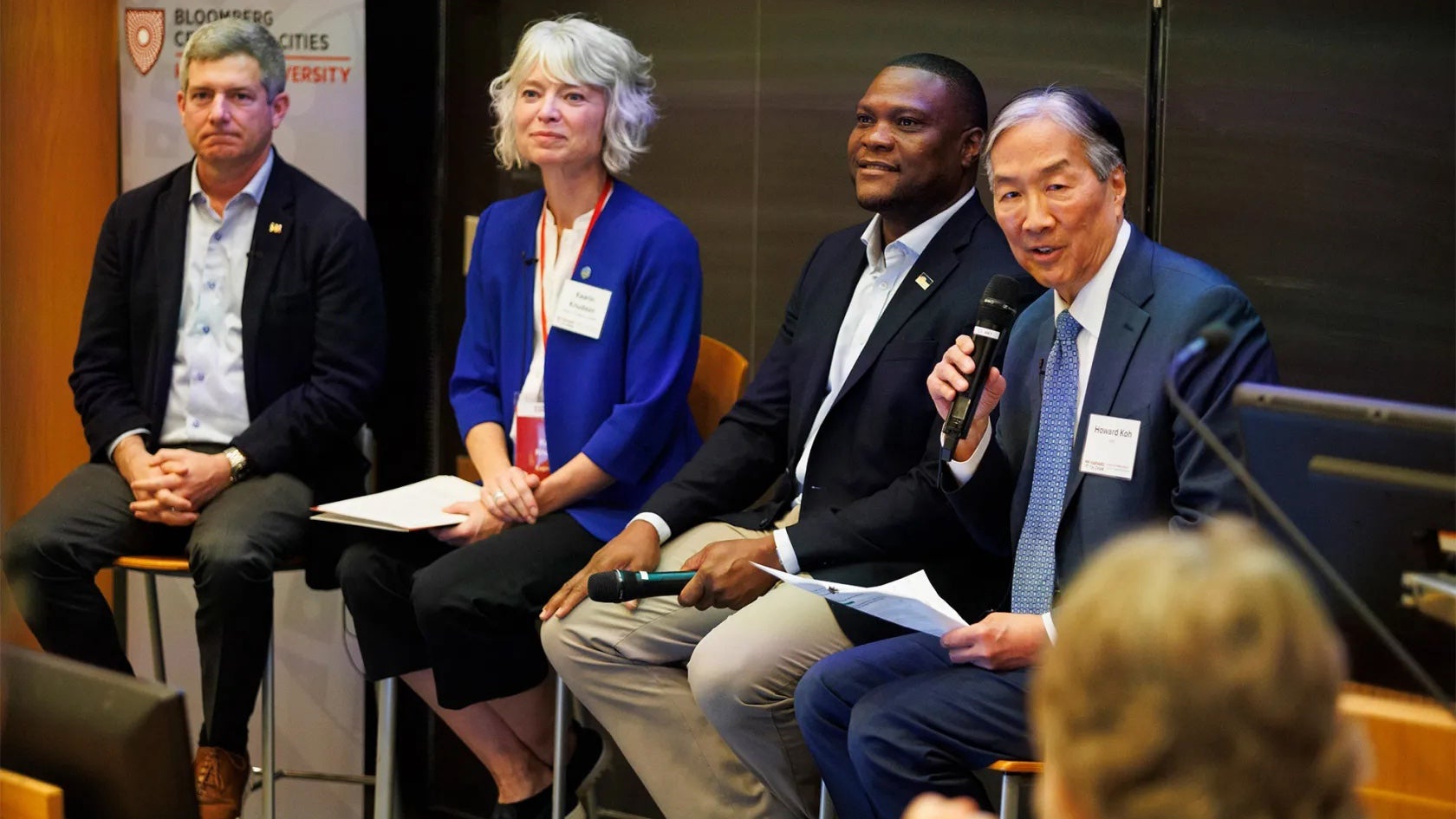
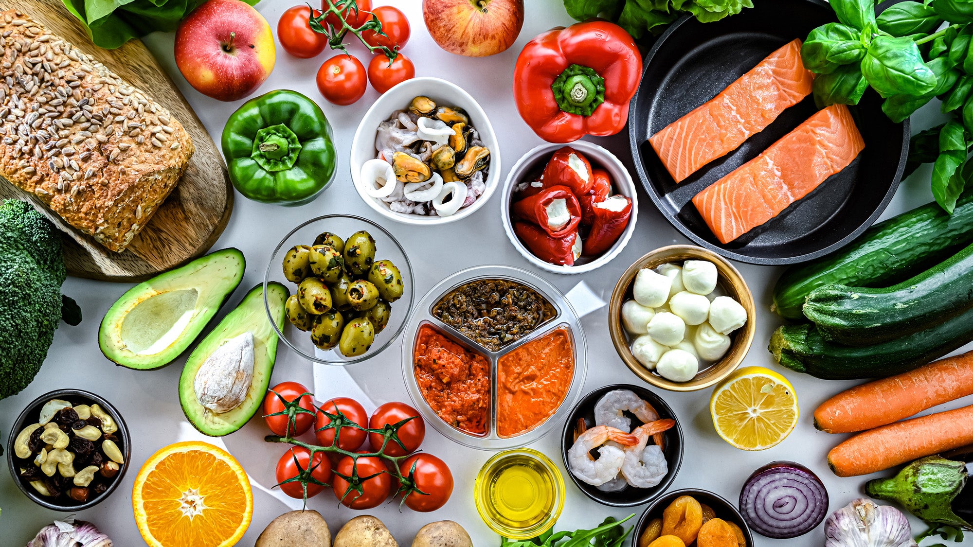
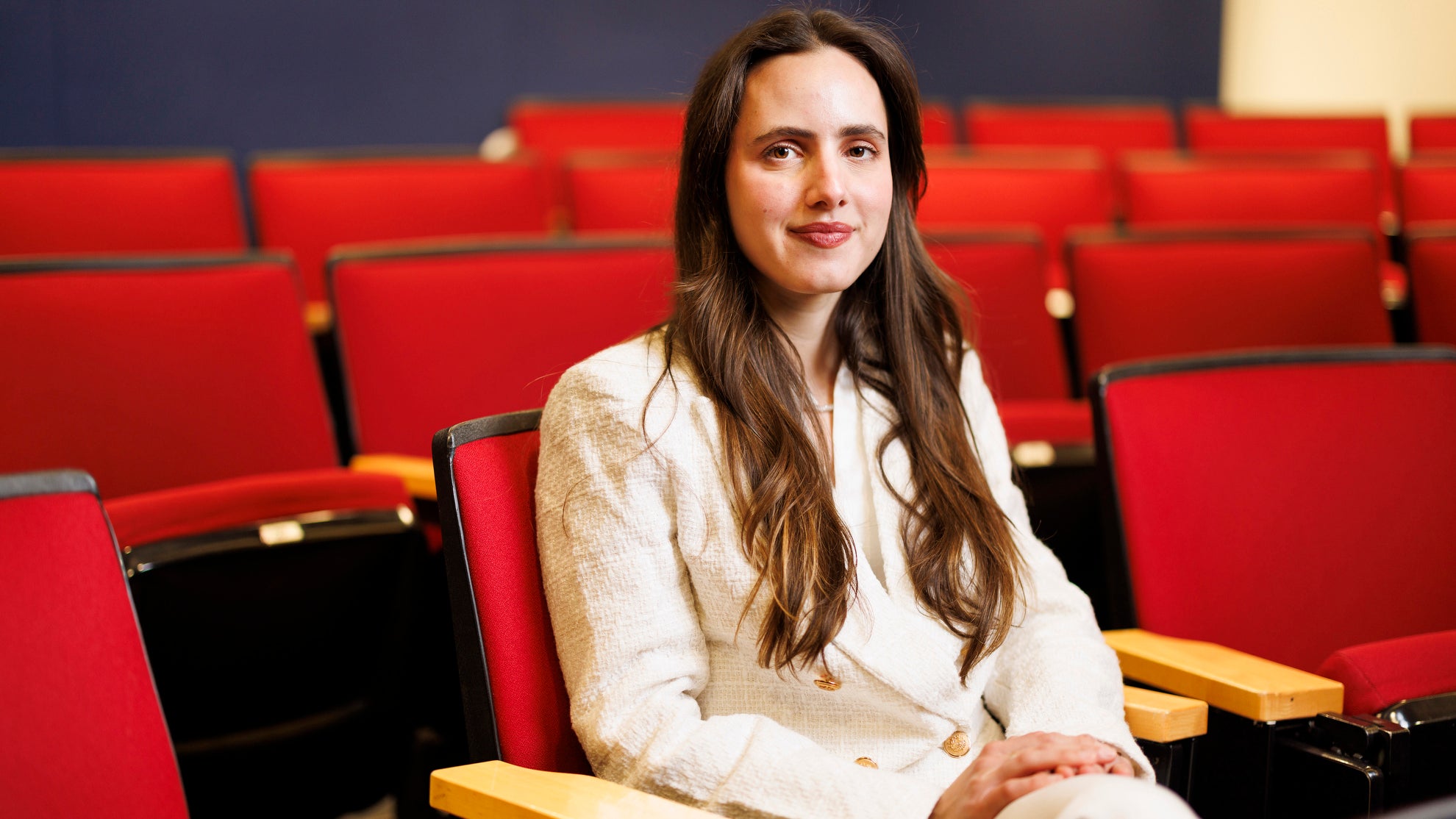
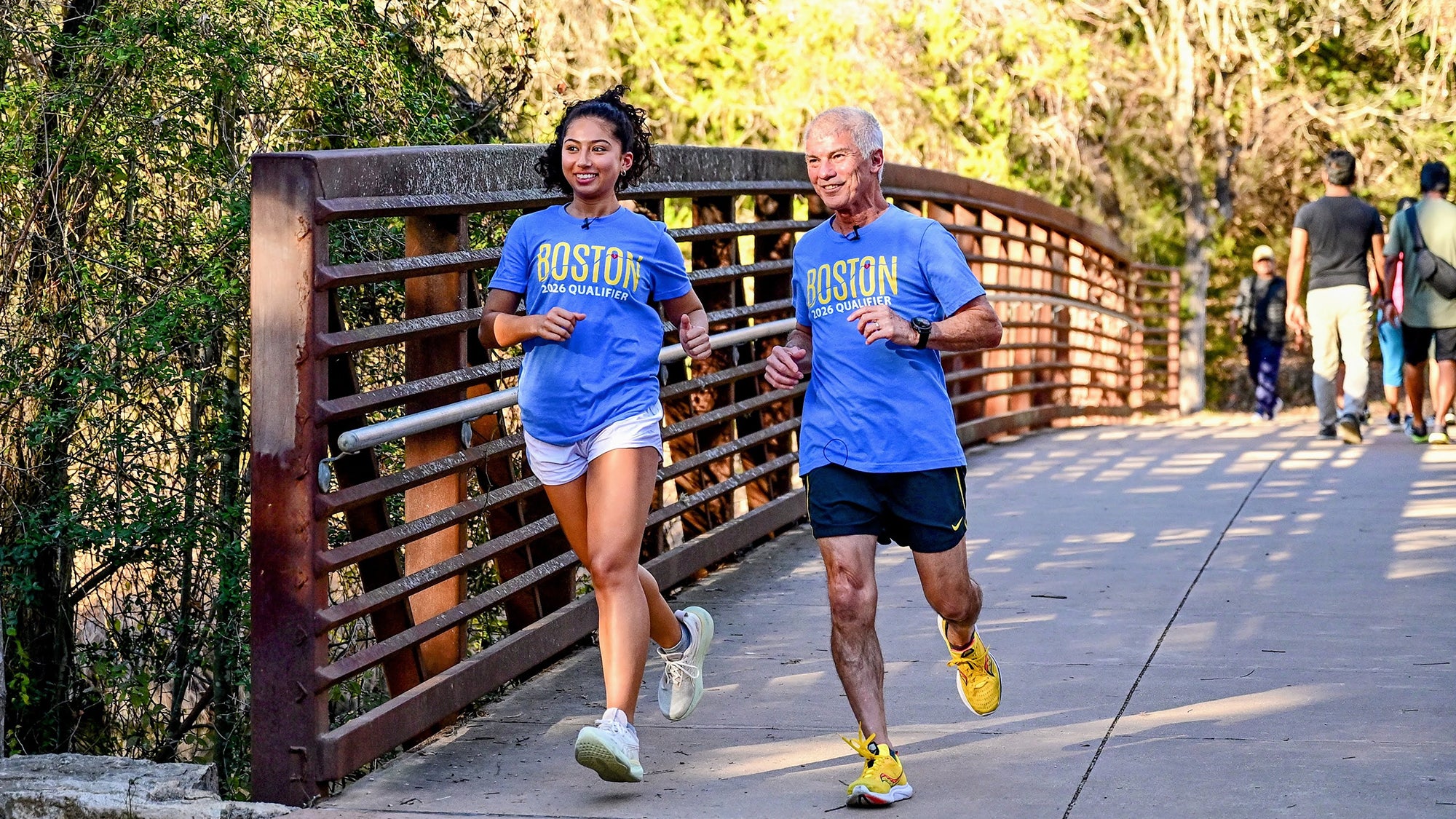
/* CSS Document */

/*Hides archive link issue from list of back issues*/

.other-issue div:nth-of-type(5) {
    display:none;
}

/*Fixes image to 100% under 800px for ones with figure captions*/

@media screen and (max-width: 1300px) {
.site-main #primary .entry-content figure {
    width: 50% !important;
}
}

@media screen and (max-width: 1000px) {
.site-main #primary .entry-content figure {
    width: 50% !important;
}
	
	.site-main #primary .entry-content img.alignright {
    width: 50%;
}
}

@media screen and (max-width: 500px) {
.site-main #primary .entry-content figure {
    width: 100% !important;
}
	
	.site-main #primary .entry-content img.alignright {
    width: 100%;
}
}

/*max-width for basic articles for better readability*/

body:not(.magazine-feature) #primary .entry-content p,
body:not(.magazine-feature) #primary .entry-content blockquote,
body:not(.magazine-feature) #primary .entry-content h1,
body:not(.magazine-feature) #primary .entry-content h2,
body:not(.magazine-feature) #primary .entry-content h3,
body:not(.magazine-feature) #primary .entry-content h4,
body:not(.magazine-feature) #primary .entry-content h5,
body:not(.magazine-feature) #primary .entry-content h6 {
    max-width: 900px;
}

/*0*/

/*Global*/

.gallery-row {
    margin: auto;
}

.magazine-feature .site-main #primary .entry-content .content-sidebar p, 
.magazine-feature .site-main #primary .entry-content .content-sidebar h1, 
.magazine-feature .site-main #primary .entry-content .content-sidebar h2, 
.magazine-feature .site-main #primary .entry-content .content-sidebar h3, 
.magazine-feature .site-main #primary .entry-content .content-sidebar h4, 
.magazine-feature .site-main #primary .entry-content .content-sidebar h5, 
.magazine-feature .site-main #primary .entry-content .content-sidebar h6, 
.magazine-feature .site-main #primary .entry-content .content-sidebar ul, 
.magazine-feature .site-main #primary .entry-content .content-sidebar ol, 
.magazine-feature .site-main #primary .entry-content .content-sidebar figure, 
.magazine-feature .site-main #primary .entry-content .content-sidebar table, 
.magazine-feature .site-main #primary .entry-content .content-sidebar blockquote,
.magazine-feature .site-main #primary .entry-content .content-area p, 
.magazine-feature .site-main #primary .entry-content .content-area h1, 
.magazine-feature .site-main #primary .entry-content .content-area h2, 
.magazine-feature .site-main #primary .entry-content .content-area h3, 
.magazine-feature .site-main #primary .entry-content .content-area h4, 
.magazine-feature .site-main #primary .entry-content .content-area h5, 
.magazine-feature .site-main #primary .entry-content .content-area h6, 
.magazine-feature .site-main #primary .entry-content .content-area ul, 
.magazine-feature .site-main #primary .entry-content .content-area ol, 
.magazine-feature .site-main #primary .entry-content .content-area figure, 
.magazine-feature .site-main #primary .entry-content .content-area table, 
.magazine-feature .site-main #primary .entry-content .content-area blockquote {
    padding: 0;
}


.site-info .site-footer-logo a {
    width: 100%;
    max-width: 360px;
}


h3.sd-title {
    text-align: left !important;
}

/*readability adjustment for regular articles*/

.content-area .type-magazine_article:not(.featured-article){
    max-width: 1200px;
}

.magazine-feature .site-main .entry-header .featured-article-overlay-image {
    position: absolute;
    top: 0;
    width: 100%;
}

.magazine-feature .site-main .entry-header .featured-article-overlay-image img {
    width: 100%;
}


.magazine-feature .entry-footer {
    margin-top:0;
}


@media screen and (max-width: 399px) {
.site-branding .site-description {
	display: none;
}
}

@media screen and (max-width: 768px) {
	.featured-article-overlay-image {
		display: none;
	}
	
}


/*Homepages*/


/*Fall 2016*/
.page-id-111354827417 .site-content #magazine-carousel .carousel-slide-text {
	left: 0;
	padding: 22px 30px 25px 6%;
}

.page-id-111354827417 .site-content #magazine-stories-container #magazine-main-contents-column .widget_magazine_menu ul li:first-child .news-post-thumbnail, .page-id-111354827417 .site-content #magazine-stories-container #magazine-main-contents-column .widget_magazine_menu ul li:nth-child(2) .news-post-thumbnail {
	position: relative;
}

.page-id-111354827417 .site-content #magazine-stories-container #magazine-main-contents-column .widget_magazine_menu ul li:first-child .news-post-thumbnail:before, .page-id-111354827417 .site-content #magazine-stories-container #magazine-main-contents-column .widget_magazine_menu ul li:nth-child(2) .news-post-thumbnail:before {
	content: 'feature';
	font-weight: 700;
	text-transform: uppercase;
	font-size: 14px;
	font-size: .8125rem;
	padding: 2px 8px 0;
	position: absolute;
	bottom: 0;
	background-color: rgba(0,0,0,0.7);
	color: #ffffff;
}

.current-issue .magazine-cover-title {
	margin-bottom: 20px;
}

/*Winter 2017 111354827894 */

.page-id-111354827894 .site-content #magazine-stories-container #magazine-main-contents-column .widget_magazine_menu ul li:first-child .news-post-thumbnail, .page-id-111354827894 .site-content #magazine-stories-container #magazine-main-contents-column .widget_magazine_menu ul li:nth-child(2) .news-post-thumbnail {
	position: relative;
}

.page-id-111354827894 .site-content #magazine-stories-container #magazine-main-contents-column .widget_magazine_menu ul li:first-child .news-post-thumbnail:before, .page-id-111354827894 .site-content #magazine-stories-container #magazine-main-contents-column .widget_magazine_menu ul li:nth-child(2) .news-post-thumbnail:before {
	content: 'feature';
	font-weight: 700;
	text-transform: uppercase;
	font-size: 14px;
	font-size: .8125rem;
	padding: 2px 8px 0;
	position: absolute;
	bottom: 0;
	background-color: rgba(0,0,0,0.7);
	color: #ffffff;
}


/*Spring 2017*/

.page-id-111354828180 .site-content #magazine-stories-container #magazine-main-contents-column .widget_magazine_menu ul li:first-child .news-post-thumbnail, .page-id-111354828180 .site-content #magazine-stories-container #magazine-main-contents-column .widget_magazine_menu ul li:nth-child(2) .news-post-thumbnail {
	position: relative;
}

.page-id-111354828180 .site-content #magazine-stories-container #magazine-main-contents-column .widget_magazine_menu ul li:first-child .news-post-thumbnail:before, .page-id-111354828180 .site-content #magazine-stories-container #magazine-main-contents-column .widget_magazine_menu ul li:nth-child(2) .news-post-thumbnail:before {
	content: 'feature';
	font-weight: 700;
	text-transform: uppercase;
	font-size: 14px;
	font-size: .8125rem;
	padding: 2px 8px 0;
	position: absolute;
	bottom: 0;
	background-color: rgba(0,0,0,0.7);
	color: #ffffff;
}


/*Winter 2018*/


.page-id-111354828898 #magazine-carousel .carousel-slide-text {
    background-color: rgba(68,68,68, 0.7);
}


.page-id-111354828898 .site-content #magazine-stories-container #magazine-main-contents-column .widget_magazine_menu ul li:first-child .news-post-thumbnail, .page-id-111354828180 .site-content #magazine-stories-container #magazine-main-contents-column .widget_magazine_menu ul li:nth-child(2) .news-post-thumbnail {
	position: relative;
}

.page-id-111354828898 .site-content #magazine-stories-container #magazine-main-contents-column .widget_magazine_menu ul li:first-child .news-post-thumbnail:before, .page-id-111354828180 .site-content #magazine-stories-container #magazine-main-contents-column .widget_magazine_menu ul li:nth-child(2) .news-post-thumbnail:before {
	content: 'feature';
	font-weight: 700;
	text-transform: uppercase;
	font-size: 14px;
	font-size: .8125rem;
	padding: 2px 8px 0;
	position: absolute;
	bottom: 0;
	background-color: rgba(0,0,0,0.7);
	color: #ffffff;
}

/*Fall 2018*/

.page-id-111354829721 .site-content #magazine-stories-container #magazine-main-contents-column .widget_magazine_menu ul li:first-child .news-post-thumbnail, .page-id-111354828180 .site-content #magazine-stories-container #magazine-main-contents-column .widget_magazine_menu ul li:nth-child(2) .news-post-thumbnail {
	position: relative;
}

.page-id-111354829721 .site-content #magazine-stories-container #magazine-main-contents-column .widget_magazine_menu ul li:first-child .news-post-thumbnail:before {
    content: 'feature';
    font-weight: 700;
    text-transform: uppercase;
    font-size: 14px;
    font-size: .8125rem;
    padding: 2px 8px 0;
    position: absolute;
    bottom: 0;
    background-color: rgba(0,0,0,0.7);
    color: #ffffff;
}

/*Fall 2019*/

.page-id-111354830940 .site-content #magazine-stories-container #magazine-main-contents-column .widget_magazine_menu ul li:first-child .news-post-thumbnail, .page-id-111354830940 .site-content #magazine-stories-container #magazine-main-contents-column .widget_magazine_menu ul li:nth-child(2) .news-post-thumbnail {
	position: relative;
}

.page-id-111354830940 .site-content #magazine-stories-container #magazine-main-contents-column .widget_magazine_menu ul li:first-child .news-post-thumbnail:before, .page-id-111354830940 .site-content #magazine-stories-container #magazine-main-contents-column .widget_magazine_menu ul li:nth-child(2) .news-post-thumbnail:before, .page-id-111354830940 .site-content #magazine-stories-container #magazine-main-contents-column .widget_magazine_menu ul li:nth-child(2) .news-post-thumbnail:before {
	content: 'feature';
	font-weight: 700;
	text-transform: uppercase;
	font-size: 14px;
	font-size: .8125rem;
	padding: 2px 8px 0;
	position: absolute;
	bottom: 0;
	background-color: rgba(0,0,0,0.7);
	color: #ffffff;
}


/*A*/


/*A Bigger Examining Room*/

.postid-111354827798 .site-main .entry-header .featured-article-text h1 {
    text-align: right;
}

.postid-111354827798 .site-main .entry-header .featured-article-text h2 {
    text-align: right;
    padding-left: 6%;
}


@media screen and (min-width: 400px) {
.postid-111354827798 .featured-article-text-inside {
    margin: 0;
}
}

.postid-111354827798 .site-main .header-position-right .entry-header .featured-article-text {
    padding-bottom: 60px;


}


@media screen and (max-width: 1020px) {
.postid-111354827798 .site-main .header-position-right .entry-header .featured-article-text {
    padding-right: 50px;
    padding-bottom: 35px;
}
}


@media screen and (max-width: 740px) {
.postid-111354827798 .site-main .header-position-right .entry-header .featured-article-text {
    padding-left:40px;
}


}

@media screen and (max-width: 430px) {

.postid-111354827798 .site-main .entry-header .featured-article-text h2 {
font-size:small
}

}

@media screen and (min-width: 1100px) {
.postid-111354827798 .featured-article-text-inside {
    max-width: 572px;
}
}


/*Aging Game, The*/
.postid-111354825669 span.aging-highlighted {
	color: #569034;
}

.postid-111354825669 .site-main .entry-header .featured-article-text h1 {
	text-shadow: none;
}

.postid-111354825669 .site-main .entry-header .featured-article-text h2, 
.postid-111354825669 .site-main #primary .entry-content h2 {
	font-weight: 400;
}

.postid-111354825669 .tableau-fig-mobile {
	position: relative;
	left: 0;
	right: 0;
	margin: auto;
	width: 264px;
	display: block;
}

.postid-111354825669 .tableau-fig-desktop {
	display: none;
}

.postid-111354825669 .site-main #primary .entry-content img.aligncenter {
	margin: 0 auto .75em;
}

@media screen and (min-width: 500px) {
	.postid-111354825669 .tableau-fig-mobile {
		display: none;
	}
	
	.postid-111354825669 .tableau-fig-desktop {
		position: relative;
		left: 0;
		right: 0;
		margin: auto;
		width: 424px;
		display: block;
	}
}

.postid-111354825669 .site-main #primary .entry-content h1 {
	font-weight: 700;
	font-size: 40px;
	font-size: 2.5rem;
	color: #569034;
	line-height: 1.1;
}

.postid-111354825669 .site-main #primary .entry-content h5 {
	color: #807d7d;
}

@media screen and (min-width: 800px) {
	.postid-111354825669 .site-main .entry-header .featured-article-text {
		top: 80px;
		height: initial;
	}
	
	.postid-111354825669 .site-main .header-position-right .entry-header .featured-article-text {
		right: -130px;
	}
}

.postid-111354825669 .site-main #primary .entry-content blockquote p {
	margin: 10px 13%;
	font-size: 17px;
	font-size: 1.0625rem;
	text-align: left;
	color: #595859;
	font-family: 'Proxima', sans-serif;
}

.postid-111354825669 .site-main #primary .entry-content blockquote {
	border-left: 5px solid #569034;
	border-bottom: none;
	border-top: none;
}

@media screen and (max-width: 549px) {
	.postid-111354825669 .site-main #primary .entry-content blockquote p {
		margin: 30px 0;
	}
}

@media screen and (min-width: 1500px) {
	.postid-111354825669 .site-main .entry-header .featured-article-text h1 {
		font-size: 90px;
		font-size: 5.625rem;
	}
}

@media screen and (min-width: 1100px) {
	.postid-111354825669 .site-main .entry-header .featured-article-text h1 {
		font-size: 90px;
		font-size: 5.625rem;
	}
}

/*A better flowchart for medical discovery*/

.postid-111354831709 #primary .entry-content aside.content-area {
    padding: 110px 20px 80px 20px;
    margin: 60px 0 60px 0;
    overflow: hidden;
    color: #f8f0f4;
}

.postid-111354831709 #primary .entry-content .content-area .content-area-inside h4 {
    font-size: 143%;
    line-height: 1.5;
}

.postid-111354831709 #primary .entry-content h5 {
    font-size: 95%;
    text-transform: uppercase;
    letter-spacing: 2px;
    line-height: 1.5;
    font-family: 'Montserrat', sans-serif;
    margin-top: 1rem;
}

.postid-111354831709 #primary .entry-content .content-area .content-area-inside h5 {
    color: #fff;
}

.postid-111354831709 .site-main .entry-header .featured-article-text h1 {
    text-shadow: none;
}
.postid-111354831709 .site-main .entry-header .featured-article-text h2 {
    margin: auto;
    margin-top: 1rem;
    line-height: 1.3;
}
@media screen and (max-width: 768px) {
.postid-111354831709 .site-main .entry-header .featured-article-text {
    position: relative;
    display: block;
    background-color: #000;
    padding: 1.5rem 5px 1.5rem 5px;
}
.postid-111354831709 .site-main .entry-header .featured-article-text h1 {
    font-size: 200%;
}

.postid-111354831709 .site-main .entry-header .featured-article-text h2 {
    font-size: 120%;
}


}


@media screen and (max-width: 900px) {
.postid-111354831709 .featured-article-text-inside {
    margin: 0 20px;
}

}


/*America is failing its black mothers*/

.postid-111354830229 .site-main .entry-header .featured-article-text h1 {
    text-shadow: none;
    font-size: 38px;
    font-size: 2.375rem;
    line-height: 1.125;
    margin-bottom: 12px;
    text-align: left;
    text-transform: uppercase;
}

.postid-111354830229 .site-main .entry-header .featured-article-text h2 {
    font-size: 14px;
    font-size: .875rem;
    text-align: left;
    margin-left: 0.75%;
}

.postid-111354830229 .site-main .entry-header .featured-article-text h2:after {
    display: block;
    content: "Winter 2019 | by Amy Roeder";
    margin-top: 1em;
}

.postid-111354830229 .site-main .entry-header .featured-article-text {
    display: contents;
}

.postid-111354830229 .site-main .entry-header .featured-article-text {
    display: contents;
}

.postid-111354830229 .featured-article-text-inside {
    margin: 20px 20px 0;
}


.postid-111354830229 span.bwh-dc {
    float: left;
    line-height: 55px;
    padding-top: 2px;
    padding-right: 8px;
    margin-left:-3px;
    color: #0a0a0a;
    text-transform: uppercase;
    font-size: 54px;
    text-shadow: none;
    font-family: 'Open Sans', sans-serif;
    font-weight: 700;
}

.postid-111354830229 aside.content-sidebar.bwh-sb.alignright.related {
    max-width: 450px !important;
    margin: auto;
}

.postid-111354830229 aside.content-area.bwh-ca {
    background: #ff6e76;
    background: -moz-linear-gradient(top, rgb(255, 110, 118) 0%, rgb(251, 82, 122) 100%);
    background: -webkit-linear-gradient(top, rgb(255, 110, 118) 0%,rgb(251, 82, 122) 100%);
    background: linear-gradient(to bottom, rgb(255, 110, 118) 0%,rgb(251, 82, 122) 100%);
    filter: progid:DXImageTransform.Microsoft.gradient(startColorstr='#ff6e76', endColorstr='#fb527a');
    color: #fff;
}

.postid-111354830229 aside.content-area.bwh-ca h2:after {
    content:"_________";
    display:block;
    margin: 30px 0 50px 0;
}

.postid-111354830229 .site-main #primary .entry-content h2,
.postid-111354830229 .site-main #primary .entry-content h3 {
    text-transform:uppercase;
}

.postid-111354830229 aside.content-area.bwh-big-img {
    padding: 0;
}

.postid-111354830229 .wp-caption .wp-caption-text {
    padding: 5px 10px;
    color: #0a0a0a;
    text-shadow: none;
    font-family: 'Open Sans', sans-serif;
    font-weight:400;
    font-style: normal;
}

.postid-111354830229 .wp-caption .wp-caption-text::before {
    content: "▲";
    font-size: 11px;
    margin: 0 4px 0 -7px;
}

@media screen and (min-width: 400px) {

.postid-111354830229 .featured-article-text-inside {
    margin: 20px 20px;
}

}

@media screen and (min-width: 500px) {
.postid-111354830229 .site-main .entry-header .featured-article-text h1 {
    font-size: 44px;
    font-size: 2.75rem;
}

}


@media screen and (min-width:768px) {

.postid-111354830229 aside.content-sidebar.bwh-sb.alignright.related {
    padding: 0 30px 0 0;
    min-width: 0;
    max-width: 350px !important;
    width: 50%;
    margin: 0.375em 0 20px 1.75em;
}

}

@media screen and (min-width: 769px) {

.postid-111354830229 .site-main .entry-header .featured-article-image {
    display: none;
}

.postid-111354830229 .site-main .entry-header .featured-article-responsive-image {
    display: block;
}

}

@media screen and (min-width: 800px) {

.postid-111354830229 .site-main .entry-header .featured-article-responsive-image {
    display: none;
}

.postid-111354830229 .site-main .entry-header .featured-article-image {
    display: block;
}

.postid-111354830229 .site-main .entry-header .featured-article-text {
    display: flex;
}

.postid-111354830229 .site-main .header-position-right .entry-header .featured-article-text {
    padding-bottom: 0px;
}

}


@media screen and (min-width: 1100px) {

.postid-111354830229 .site-main .entry-header .featured-article-text h1 {
    font-size: 3.125vw;
}

}


@media screen and (min-width:1166px) {

.postid-111354830229 aside.content-sidebar.bwh-sb.alignright.related {
    margin-right: calc( 50% - 572px );
}

.postid-111354830229 .featured-article-text-inside {
    padding-bottom: 10vh;
    padding-left: 5vw;
}

}


/* An Obligation to Take Risks */
.postid-111354826978 .site-main .entry-header .featured-article-text h1 {
	word-wrap: normal;
}

.postid-111354826978 .site-main .entry-header {
	margin-bottom: 0;
}

.postid-111354826978 .site-main #primary .entry-content aside.content-area.michelle-opener {
	margin-top: 0;
}

.postid-111354826978 .site-main #primary .entry-content aside.content-area.michelle-opener h3:first-child::first-letter {
	font-size: 170px;
	float: left;
	line-height: .5;
	margin-left: -10px;
	margin-right: 8px;
	color: #6E9EAF;
}

.postid-111354826978 .site-main #primary .entry-content aside.content-area.michelle-opener h3 {
	font-weight: 400;
	font-size: 23px;
	line-height: 1.6;
}

.postid-111354826978 .site-main #primary .entry-content aside.content-area.michelle-content-area h3 {
	font-weight: 400;
	font-size: 23px;
	line-height: 1.6;
	margin: 0;
	padding: 0;
}

.postid-111354826978 .site-main #primary .entry-content p strong {
	font-family: 'Libre Baskerville', serif;
	font-weight: 700;
	font-size: 16px;
	font-size: 1rem;
	line-height: 1;
	color: #6e9eaf;
}

.postid-111354826978 .site-main #primary .entry-content blockquote h3 {
	color: #6e9eaf;
	margin: 0;
}

.postid-111354826978 .site-main #primary .entry-content .content-sidebar.alignright.related h3, .postid-111354826978 .site-main #primary .entry-content aside.content-sidebar.block-quote.alignleft.related h3 {
	color: #6e9eaf;
	margin-top: 30px;
}

.postid-111354826978 .site-main #primary .entry-content aside.content-sidebar.block-quote.alignleft.related h3 {
	font-size: 24px;
	margin-bottom: -30px;
	margin-top: 0;
}

.postid-111354826978 .site-main #primary .entry-content blockquote {
	padding: 20px;
	outline: none;
	border: none;
	background-color: #ebf1f3;
	margin-bottom: 25px;
}

.postid-111354826978 .site-main #primary .entry-content .content-sidebar.alignright.related, .postid-111354826978 .site-main #primary .entry-content aside.content-sidebar.block-quote.alignleft.related {
	background-color: #ebf1f3;
}

.postid-111354826978 .site-main #primary .entry-content div.mich-col .column-two {
	margin-left: 30px;
}

.postid-111354826978 .site-main #primary .entry-content div.mich-col .column-one {
	margin-bottom: 30px;
}

.postid-111354826978 .site-main #primary .entry-content figure {
	padding: 0;
}

.postid-111354826978 .site-main #primary .entry-content .wp-caption .wp-caption-text {
	font-size: 13px;
	font-size: .8125rem;
	font-style: normal;
	line-height: 1.6153846154;
	padding-top: .5384615385em;
	text-transform: uppercase;
	font-family: 'proxima-nova', "Helvetica Neue", sans-serif;
	background-color: #ebf1f3;
	color: #6e9eaf;
	font-weight: 700;
	padding: 25px;
}


/*Base mobile*/
.postid-111354826978 .site-main .entry-header .featured-article-text {
	padding: 40px 0;
	position: relative;
	background-color: #6e9eaf;
}

.postid-111354826978 .site-main .entry-header .featured-article-text h1 {
	text-shadow: none;
	font-weight: 400;
	text-transform: uppercase;
	margin-bottom: 20px;
}

.postid-111354826978 .site-main .entry-header .featured-article-text h1 {
	font-size: 35px;
	font-size: 2.1875rem;
}

@media screen and (min-width: 400px) {
	.postid-111354826978 .featured-article-text-inside {
		margin: 0 5%;
	}
	
	.postid-111354826978 .site-main .entry-header .featured-article-text h1 {
		font-size: 45px;
		font-size: 2.813rem;
	}
}

@media screen and (min-width: 550px) {
	.postid-111354826978 .site-main .entry-header .featured-article-text h1 {
		font-size: 55px;
		font-size: 3.438rem;
	}
}

@media screen and (min-width: 769px) {
	.postid-111354826978 .site-main #primary .entry-content .content-sidebar.related {
		width: 26%;
		min-width: 445px;
	}
}

@media screen and (max-width: 768px) {
	.postid-111354826978 .site-main #primary .entry-content figure.wp-caption.alignright {
		padding: 0;
	}
}

@media screen and (min-width: 800px) {
	.postid-111354826978 .site-main .header-position-left .entry-header .featured-article-text {
		width: 100%;
		text-align: center;
		justify-content: flex-end;
		padding: 40px 13%;
	}
}

@media screen and (min-width: 1100px) {
	.postid-111354826978 .site-main .entry-header .featured-article-text {
		background-color: rgba(110,158,175,.8);
	}
	
	.postid-111354826978 .site-main .header-position-left .entry-header .featured-article-text {
		position: absolute;
		width: 50%;
		max-width: 737px;
		text-align: left;
		justify-content: flex-end;
		padding: 40px;
		height: auto;
		bottom: 0;
		top: initial;
	}
}

@media screen and (min-width: 1250px) {
	.postid-111354826978 .site-main .entry-header .featured-article-text h1 {
		font-size: 70px;
		font-size: 4.375rem;
	}
}

@media screen and (min-width: 1440px) {
	.postid-111354826978 .site-main .entry-header .featured-article-text h1 {
		font-size: 80px;
		font-size: 4s.375rem;
	}
}


/*B*/


/*Bugs in the System*/


.postid-111354828134 .site-main .entry-header {
    background: url(https://cdn1.sph.harvard.edu/wp-content/uploads/sites/54/2017/05/GUT-gif.gif);
    background-size: cover;
}


.postid-111354828134 .site-main #primary .entry-content h3 {
    color: #018ab6;
    font-size: 26px;
    margin-top: 0;
    margin-bottom: .75em;
}

.postid-111354828134 span.bugs-dropcap {
    font-family: 'Crimson Text', serif;
    color: #ef4783;
    float: left;
    font-size: 120px;
    font-size: 7.5rem;
    line-height: .5;
    margin: 31px 10px -6px -11px;
}

.postid-111354828134 .site-main .entry-header .featured-article-text h1 {
    text-shadow: none;
}

.postid-111354828134 .site-main #primary .entry-content aside.content-area.bugs-ca {
    padding: 0;
    margin: 0;
}

.postid-111354828134 .site-main #primary .entry-content aside.content-area.bugs-ca img {
    width:100%;
    margin-bottom: -27px;
}


.postid-111354828134 .site-main #primary .entry-content aside.content-area.bugs-ca blockquote {
    background-color:#018ab6;
    background: url('https://cdn1.sph.harvard.edu/wp-content/uploads/sites/54/2017/05/Screen-Shot-2017-05-26-at-3.54.28-PM-1024x623.png');
    background-repeat: repeat;
    background-size: 520px;
    color:#fff;
    border:none;
    padding:20px 20px 20px 20px;
    font-family: 'proxima-nova', "Helvetica Neue", sans-serif;
    font-size:25px;
    margin: 0 20px;
}

.postid-111354828134 .site-main #primary .entry-content aside.content-area.bugs-ca blockquote p:last-child {
    font-size:16px;
}

.postid-111354828134 .site-main #primary .entry-content aside.content-area.bugs-ca blockquote p:first-child {
    margin-bottom:15px;
    line-height:1.3;
}

@media screen and (min-width: 700px) {
    .postid-111354828134 .site-main #primary .entry-content aside.content-area.bugs-ca blockquote {
    margin:0 40px;
    }
    .postid-111354828134 .site-main #primary .entry-content aside.content-area.bugs-ca blockquote p {
    margin:0;
    }
}

@media screen and (min-width: 1024px) {
    .postid-111354828134 .site-main #primary .entry-content aside.content-area.bugs-ca blockquote {
        margin: auto;
        max-width: 944px;
        }
}


@media screen and (min-width: 1084px) {
    .postid-111354828134 .site-main #primary .entry-content aside.content-area.bugs-ca {
       width:500px;
       float:right;
       margin-right:5%;
       margin-left:20px;
        }
}

@media screen and (max-width: 549px) {
.postid-111354828134 .site-main .entry-header {
    background: url(https://cdn1.sph.harvard.edu/wp-content/uploads/sites/54/2017/05/Gut.gif);
    background-size: contain;
    background-repeat: no-repeat;
}


.postid-111354828134 .site-main .entry-header .featured-article-text {
    position: relative;
	margin-top:2em
}

.postid-111354828134 .site-main .entry-header .featured-article-text h1 {
	color:#018ab6;
	font-size:56px;
	line-height:1;
	margin-bottom:15px;
}
.postid-111354828134 .site-main .entry-header .featured-article-text h2 {
	color:#ef4783;
}

}

@media screen and (min-width: 810px) {
.postid-111354828134 .site-main .entry-header .featured-article-text h1 {
    font-size: 80px;
    line-height: 1;
}
.postid-111354828134 .site-main .header-position-left .entry-header .featured-article-text {
    width: 50%;
    text-align: left;
    justify-content: flex-end;
    padding-bottom: 3%;
    padding-left: 10%;
}

}

@media screen and (max-width: 810px) and (min-width: 550px) {
 .postid-111354828134 .site-main .entry-header .featured-article-text h2 {
	font-size:12px;
}
.postid-111354828134 .site-main .entry-header .featured-article-text h1 {
    font-size: 60px;
    line-height: 1;
    width: 185px;
}
}

@media screen and (max-width: 1100px) and (min-width: 810px) {
.postid-111354828134 .site-main .entry-header .featured-article-text h1 {
    width:250px;
}
.postid-111354828134 .site-main .header-position-left .entry-header .featured-article-text {
    padding-bottom: 5%;
}
}

@media screen and (max-width: 1249px) {
.postid-111354828134 .site-main .entry-header {
	margin-bottom:90px;
}
.postid-111354828134 .sd-content.top-buttons {
    margin-top: -60px;
}
}


@media screen and (min-width: 550px) {
	.postid-111354828134 .site-main .header-position-left .entry-header .featured-article-text {
		padding-left:0;
	}
.postid-111354828134 .site-main .header-position-left .entry-header .featured-article-text {
    width: 50%;
    text-align: left;
    justify-content: flex-end;
}
}
 
@media screen and (min-width: 1100px) {
.postid-111354828134 .site-main .entry-header .featured-article-text h1 {
    font-size: 110px;
    font-size: 6.875rem;
    line-height: 1;
}
.postid-111354828134 .site-main .header-position-left .entry-header .featured-article-text {
    padding: 60px 0;
    width: 490px;
}
.postid-111354828134 .site-main .entry-header .featured-article-text h2 {
    width:115%;
}
}

@media screen and (min-width: 1240px) {
.postid-111354828134 .site-main .entry-header .featured-article-text h1 {
    font-size: 154px;
    font-size: 9.625rem;
    line-height: 1;
}
.postid-111354828134 .site-main .header-position-left .entry-header .featured-article-text {
    padding: 60px 0;
    width: 685px;
}

.postid-111354828134 .site-main .entry-header .featured-article-text h2 {
    width:100%;
}
}


/*C*/


/*Cancer Miracle Isn't a Cure. It's Prevention, The*/

.postid-111354830943 .site-main .entry-header {
    display: none;
}

.postid-111354830943 .site-main .entry-header .featured-article-text h1 {
    display: none;
}

.postid-111354830943 .cancer-19-intro h1 {
    font-size: calc(28px + (10000vw - 10000px)/2000);
    color: #E01738;
    text-shadow: 0 2px 4px #e0173891;
    margin-bottom: 89px;
}

.postid-111354830943 #primary .entry-content aside.content-area.cancer-19-intro {
    padding-bottom: 88px;
    padding-top: 63px;
}

@media screen and (min-width: 1250px) {
.postid-111354830943 .sd-content.top-buttons {
    top: 1279px !important;
}
}

.postid-111354830943 .cancer-19-intro h1:nth-of-type(2) {
    margin-bottom: 147px;
    margin-top: 76px;
}

.postid-111354830943 #primary .entry-content h3 {
    font-weight:400;
}

.postid-111354830943 #primary .entry-content .content-sidebar h3 {
    font-weight:900;
    text-align:center;
}

.postid-111354830943 #primary .entry-content .alignleft.content-sidebar h3 {
    text-align:left;
    color:#000;
}

.postid-111354830943 #primary .entry-content .alignleft.content-sidebar {
    text-align: left;
    background-color: #dff4ff;
    color: #000;
	  box-shadow: 0 0px 7px #dff4ff;
}

.postid-111354830943 #primary .entry-content img {
    border-radius: 50%;
    box-shadow: 0 0px 7px #e0173891;
}

@media screen and (min-width:860px) {

.postid-111354830943 #primary .entry-content img.cancer-19-circle {
    shape-outside: circle(50%);
    webkit-shape-outside: circle(50%);
    max-width: 500px;
}

@media screen and (min-width:1250px) {

img.cancer-19-circle.alignright {
    margin-right:-60px;
}

img.cancer-19-circle.alignleft {
    margin-left:-60px;
}

}

}


/*Changing Places*/

.postid-111354829504 .site-main .entry-header .featured-article-text h1 {
    font-weight: bolder;
    text-shadow: none;
    text-align: left;
color:#FFF;
}


.postid-111354829504 .site-main .entry-header .featured-article-text h1:before {
    content: 'Airs, Waters, Places: Part Three';
    font-size: 15px;
    display: block;
    margin-left: 5px;
    width: 1000%;
    margin-bottom: 13px;
}

.postid-111354829504 .site-main .entry-header .featured-article-text h1:after {
    content: 'Are cities the key to climate solutions?';
    font-size: 17px;
    display: block;
    margin-left: 8px;
    width: 1800%;
    margin-bottom: 13px;
    text-transform: none;
}

.postid-111354829504 .opener {
    width: 80%;
    max-width: 400px;
    margin: auto;
    padding: 20px 25px;
    background-color: #fff;
    margin-top: 2em;
    margin-bottom: 5em;
}

.postid-111354829504 .opener h4 {
    margin: 0 0 20px 0;
padding:0 !important;
}


.postid-111354829504 .climate-title-box.content-sidebar {
    padding: 0 20px;
    margin: 0;
    margin-top: 4px;
    max-width: 210px;
    min-width: unset;
    word-wrap: normal;
    text-transform: uppercase;
}

.postid-111354829504 .mosquito-sidebar {
    background: #fff;
}


.postid-111354829504 #primary .entry-content .content-area .content-area-inside {
    margin: 0 auto;
}

.postid-111354829504 .featured-article-text-inside {
    padding: 0;
    margin: 0 5%;
    max-width: 67px;
    word-wrap: normal;
    text-align: center;
    text-transform: uppercase;
}

.postid-111354829504 .wp-caption .wp-caption-text {
    color: #000000;
    font-style: normal;
    max-width: 100%;
    font-family: sans-serif;
    font-weight: bolder;
}

.postid-111354829504 .site-main #primary .entry-content h5 {
    font-size: 0.75em;
    color: #000;
    font-family: 'proxima-nova', "Helvetica Neue", sans-serif;
    margin-bottom: 0;
}

@media screen and (min-width: 1450px) {
.postid-111354829504 .layout-container img {
	margin-left: -19%;
	max-width:none;
	width: 140%;
}
}

.postid-111354829504 .content-area-inside .climate-indoor-columns, 
.postid-111354829504 .content-area-inside .climate-indoor-columns h3,
.postid-111354829504 .mosquito-sidebar, 
.postid-111354829504 .site-main #primary .entry-content .mosquito-sidebar h3 {
    color: #ffffff;
}

.postid-111354829504 .content-area-inside .climate-indoor-columns h5 {
    color: #ffffff;
}

.postid-111354829504 .climate-big-info .content-area-inside .climate-indoor-columns, 
.postid-111354829504 .climate-big-info .content-area-inside .climate-indoor-columns h3 {
    color: #FFF;
}


.postid-111354829504 .site-main #primary .entry-content .content-area-inside .climate-indoor-columns p,
.postid-111354829504 .site-main #primary .entry-content .content-area-inside .climate-indoor-columns h1, 
.postid-111354829504 .site-main #primary .entry-content .content-area-inside .climate-indoor-columns h2, 
.postid-111354829504 .site-main #primary .entry-content .content-area-inside .climate-indoor-columns h3, 
.postid-111354829504 .site-main #primary .entry-content .content-area-inside .climate-indoor-columns h4, 
.postid-111354829504 .site-main #primary .entry-content .content-area-inside .climate-indoor-columns h5, 
.postid-111354829504 .site-main #primary .entry-content .content-area-inside .climate-indoor-columns h6, 
.postid-111354829504 .site-main #primary .entry-content .content-area-inside .climate-indoor-columns ul, 
.postid-111354829504 .site-main #primary .entry-content .content-area-inside .climate-indoor-columns ol, 
.postid-111354829504 .site-main #primary .entry-content .content-area-inside .climate-indoor-columns figure, 
.postid-111354829504 .site-main #primary .entry-content .content-area-inside .climate-indoor-columns table, 
.postid-111354829504 .site-main #primary .entry-content .content-area-inside .climate-indoor-columns blockquote, 
.postid-111354829504 .site-main #primary .entry-content .content-area-inside .climate-indoor-columns address, 
.postid-111354829504 .site-main #primary .entry-content .content-area-inside .climate-indoor-columns pre, 
.postid-111354829504 .site-main #primary .entry-content .content-area-inside .climate-indoor-columns .sharedaddy, 
.postid-111354829504 .site-main #primary .entry-content .content-area-inside .climate-indoor-columns dl {
padding:0;

}


.climate-circle {
    width: 65%;
    height: auto;
    min-width: 263px;
    float: right;
    margin: -69px 0 34px 0;
    border-radius: 50% 0 50% 50%;
}

.postid-111354829504 aside.content-area.climate-indoors.climate-big-info {
    color: #fff;
}

.postid-111354829504 aside.content-area.climate-indoors.climate-big-info h3 {
    color: #fff;
}


.postid-111354829504 .site-main #primary .entry-content .climate-big-info .content-area-inside .climate-indoor-columns p,
.postid-111354829504 .site-main #primary .entry-content .climate-big-info .content-area-inside .climate-indoor-columns li {
    font-family: sans-serif;
    line-height: 1.6;
}

.postid-111354829504 .climate-big-info img.climate-chart-compiled {
    max-width: 120%;
    margin-left: -20%;
    margin-top: -18%;
}

.postid-111354829504 .climate-big-info .layout-column.column-one {
    z-index: 100;
}


.postid-111354829504 .climate-big-info .layout-column.column-two.column-width-3 {
    position: relative;
}

.postid-111354829504 .site-main #primary .entry-content .clim-big-health ul li {
    margin-left: 40%;
    margin-bottom: 3px;
}


.postid-111354829504 .site-main #primary .entry-content .clim-big p,
.postid-111354829504 .site-main #primary .entry-content .clim-big h4 {
    color: #FFF;
    margin-bottom:0.35em
}


.postid-111354829504 .site-main #primary .entry-content .climate-block p {
    padding:0;
}


.postid-111354829504 aside.content-area.place-sb-1.inset {
    background: url(https://cdn1.sph.harvard.edu/wp-content/uploads/sites/54/2018/06/BB93WX.jpg);
    background-size: cover;
}

.postid-111354829504 aside.content-area.place-sb-2.inset {
    background: url(https://cdn1.sph.harvard.edu/wp-content/uploads/sites/54/2018/06/J9CA8Abig.jpg);
    background-size: cover;
}

.postid-111354829504 aside.content-area.place-sb-3.inset {
    background: url(https://cdn1.sph.harvard.edu/wp-content/uploads/sites/54/2018/06/E8RCFRbig.jpg);
    background-size: cover;
}

.postid-111354829504 aside.content-area.place-sb-4.inset {
    background: url(https://cdn1.sph.harvard.edu/wp-content/uploads/sites/54/2018/06/1524157379.758992202camb.jpg);
    background-size: cover;
}


.postid-111354829504 .climate-wildfire aside.content-sidebar.alignleft.related {
    padding: 0;
}


.postid-111354829504 .climate-wildfire aside.content-sidebar.alignleft.related h3 {
    color:#000;
}

.postid-111354829504 .climate-wildfire p {
    font-family: sans-serif;
line-height: 1.6;
}

.postid-111354829504 #primary .entry-content .climate-wildfire div.content-area-inside {
    background: #fff;
    padding: 48px;
    color: #000;
}


.postid-111354829504 .air-sidebar {
    padding: 0 20px;
    margin: 0;
    margin-top: 4px;
    max-width: 193px;
    min-width: unset;
    word-wrap: normal;
}


@media screen and (min-width: 700px) {
.postid-111354829504 .air-sidebar {
    padding: 0 40px;
}

}


@media screen and (min-width: 768px) {
.postid-111354829504 .climate-circle {
    margin: -23px -23px 0 22px;
}
}


@media screen and (min-width: 985px) {
.postid-111354829504 .climate-wildfire aside.air-sidebar.alignleft.related {
    margin-left: calc( 50% - 327px );
    margin-right: 20px;
    max-width: 150px;
}
}

@media screen and (min-width: 985px) and (max-width: 1165px) {

.postid-111354829504 .undermining-nutrition.air-sidebar {
     max-width: 240px;
}

}

@media screen and (min-width: 1166px) {

.postid-111354829504 .air-sidebar {
    padding: 0;
}

}


@media screen and (max-width: 1024px) {

.postid-111354829504 .climate-big-info .desktop-climate-big.layout-column.column-two.column-width-3 {
    display:none;
}

}

@media screen and (min-width: 1024px) {

.postid-111354829504 .climate-big-info .mobile-climate-big.layout-column.column-two.column-width-3 {
    display:none;
}

.postid-111354829504 .climate-big-info .desktop-climate-big.layout-column.column-two.column-width-3 {
    display:inherit;
}


}

@media screen and (min-width: 1024px) and (max-width: 1249px) {

.postid-111354829504 .sd-content.top-buttons {
    margin-top: 444px;
}

}

@media screen and (min-width: 400px) {

.postid-111354829504 .featured-article-text-inside {
    margin: 0 10%;
    max-width: 27px;
    word-wrap: normal;
    text-align: center;
    text-transform: uppercase;
}

.postid-111354829504 .mosquito-sidebar {
    width: 400px;
    min-width: 400px;
    background: #fff;
}

}

@media screen and (min-width: 550px) {
 
.postid-111354829504 .site-main .entry-header .featured-article-text h1 {
    font-size: 73px;
    font-size: 4.5625rem;
}

.postid-111354829504 .wp-caption .wp-caption-text {
    max-width: 70%;
}

}


@media screen and (min-width: 768px) {


.climate-circle {
    width: 65%;
    height: auto;
    min-width: 263px;
    float: right;
    margin: 0px -23px 0 22px;
    border-radius: 50% 0 50% 50%;
}

}


@media screen and (min-width: 769px) {
.postid-111354829504 .content-area-inside .climate-indoor-columns .column-one {
margin-right:1.5em;
}

}


@media screen and (min-width: 985px) and (max-width: 1165px) {

.postid-111354829504 .undermining-nutrition.content-sidebar {
     max-width: 240px;
}

}

@media screen and (min-width: 64em) {
.postid-111354829504 .site-main #primary .entry-content figure {
   padding: 0;
}

.postid-111354829504 .opener {
    width: 80%;
    max-width: 700px;
    margin: auto;
    padding: 20px 25px;
    background-color: #fff;
    margin-top: -120px;
    margin-bottom: 5em;
}


}


@media screen and (min-width: 1100px) {

.postid-111354829504 .site-main .entry-header .featured-article-text h1 {
    font-size: 98px;
    font-size: 6.125rem;
}

}

@media screen and (min-width: 1166px) {
 
.postid-111354829504 .content-sidebar.alignleft.related, .postid-111354829504 .site-main #primary .entry-content figure.wp-caption.alignleft {
    margin-left: calc( 50% - 514px );
}

.postid-111354829504 .climate-title-box.content-sidebar {
    padding: 0;
}


}

@media screen and (min-width: 1288px) {


.postid-111354829504 .site-main .entry-header .featured-article-text h1 {
    font-weight: bolder;
    text-shadow: none;
    font-size: 720%;
    text-align: left;
}

}


/*Change in the Air*/


.postid-111354828587 .site-main .entry-header .featured-article-text h1 {
    font-weight: bolder;
    text-shadow: none;
    text-align: left;
}

.postid-111354828587 .sharedaddy.sd-sharing-enabled {
    max-width: 1024px;
    margin-left: auto;
    margin-right: auto;
}

.postid-111354828587 .site-main .entry-header .featured-article-text h1:before {
    content: 'Airs, Waters, Places: Part One';
    font-size: 15px;
    display: block;
    margin-left: 5px;
    width: 1000%;
    margin-bottom: 13px;
}

.postid-111354828587 .site-main .entry-header .featured-article-text h1:after {
    content: 'Global warming and other climate shifts have fueled new and unexpected threats to health.';
    font-size: 17px;
    display: block;
    margin-left: 8px;
    width: 1800%;
    margin-bottom: 13px;
    text-transform: none;
}


.postid-111354828587 .opener {
    width: 80%;
    max-width: 400px;
    margin: auto;
    padding: 20px 25px;
    background-color: #fff;
    margin-top: 2em;
    margin-bottom: 5em;
}

.postid-111354828587 .opener h4 {
    margin: 0 0 20px 0;
padding:0 !important;
}


.postid-111354828587 .air-sidebar {
    padding: 0 20px;
    margin: 0;
    margin-top: 4px;
    max-width: 193px;
    min-width: unset;
    word-wrap: normal;
}

.postid-111354828587 #primary .entry-content .content-area .content-area-inside {
    margin: 0 auto;
}

.postid-111354828587 .featured-article-text-inside {
    padding: 0;
    margin: 0 5%;
    max-width: 67px;
    word-wrap: normal;
    text-align: center;
    text-transform: uppercase;
}


.postid-111354828587 .wp-caption .wp-caption-text {
    color: #000000;
    font-style: normal;
    max-width: 100%;
    font-family: sans-serif;
    font-weight: bolder;
}

.postid-111354828587 .site-main #primary .entry-content h5 {
    font-size: 0.75em;
    color: #000;
    font-family: 'proxima-nova', "Helvetica Neue", sans-serif;
}

.postid-111354828587 .content-area-inside .climate-indoor-columns, 
.postid-111354828587 .content-area-inside .climate-indoor-columns h3 {
    color: #546e75;
}

.postid-111354828587 .climate-big-info .content-area-inside .climate-indoor-columns, 
.postid-111354828587 .climate-big-info .content-area-inside .climate-indoor-columns h3 {
    color: #FFF;
}


.postid-111354828587 .site-main #primary .entry-content .content-area-inside .climate-indoor-columns p,
.postid-111354828587 .site-main #primary .entry-content .content-area-inside .climate-indoor-columns h1, 
.postid-111354828587 .site-main #primary .entry-content .content-area-inside .climate-indoor-columns h2, 
.postid-111354828587 .site-main #primary .entry-content .content-area-inside .climate-indoor-columns h3, 
.postid-111354828587 .site-main #primary .entry-content .content-area-inside .climate-indoor-columns h4, 
.postid-111354828587 .site-main #primary .entry-content .content-area-inside .climate-indoor-columns h5, 
.postid-111354828587 .site-main #primary .entry-content .content-area-inside .climate-indoor-columns h6, 
.postid-111354828587 .site-main #primary .entry-content .content-area-inside .climate-indoor-columns ul, 
.postid-111354828587 .site-main #primary .entry-content .content-area-inside .climate-indoor-columns ol, 
.postid-111354828587 .site-main #primary .entry-content .content-area-inside .climate-indoor-columns figure, 
.postid-111354828587 .site-main #primary .entry-content .content-area-inside .climate-indoor-columns table, 
.postid-111354828587 .site-main #primary .entry-content .content-area-inside .climate-indoor-columns blockquote, 
.postid-111354828587 .site-main #primary .entry-content .content-area-inside .climate-indoor-columns address, 
.postid-111354828587 .site-main #primary .entry-content .content-area-inside .climate-indoor-columns pre, 
.postid-111354828587 .site-main #primary .entry-content .content-area-inside .climate-indoor-columns .sharedaddy, 
.postid-111354828587 .site-main #primary .entry-content .content-area-inside .climate-indoor-columns dl {
padding:0;

}

.postid-111354828587 aside.content-area.climate-indoors.climate-big-info {
    color: #fff;
}

.postid-111354828587 aside.content-area.climate-indoors.climate-big-info h3 {
    color: #fff;
}


.postid-111354828587 .site-main #primary .entry-content .climate-big-info .content-area-inside .climate-indoor-columns p,
.postid-111354828587 .site-main #primary .entry-content .climate-big-info .content-area-inside .climate-indoor-columns li {
    font-family: sans-serif;
    line-height: 1.6;
}

.postid-111354828587 .climate-big-info img.climate-chart-compiled {
    max-width: 120%;
    margin-left: -20%;
    margin-top: -18%;
}

.postid-111354828587 .climate-big-info .layout-column.column-one {
    z-index: 100;
}


.postid-111354828587 .climate-big-info .layout-column.column-two.column-width-3 {
    position: relative;
}

.postid-111354828587 .site-main #primary .entry-content .clim-big-sources {
    position: absolute;
    top: 0;
    right: 0;
    color: #FFF;
    width: 56%;
}

.postid-111354828587 .site-main #primary .entry-content .clim-big.clim-big-coarse {
    position: absolute;
    top: 8%;
    left:0;
    width: 30%;
}

.postid-111354828587 .site-main #primary .entry-content .clim-big.clim-big-fine {
    position: absolute;
    top: 30%;
    right: 38%;
    width: 18%;
}

.postid-111354828587 .site-main #primary .entry-content .clim-big.clim-big-ultrafine {
    position: absolute;
    top: 22%;
    right: 0;
    width: 20%;
}

.postid-111354828587 .site-main #primary .entry-content .clim-big.clim-big-health {
    position: absolute;
    top: 44%;
    left: 0;
    width: 55%;
}

.postid-111354828587 .site-main #primary .entry-content .clim-big.clim-big-ozone {
    position: absolute;
    width: 64%;
    top: 82%;
}

.postid-111354828587 .site-main #primary .entry-content .clim-big.clim-big-smog {
    position: absolute;
    width: 100%;
    top: 95%;
}

.postid-111354828587 .site-main #primary .entry-content .clim-big-health ul li {
    margin-left: 40%;
    margin-bottom: 3px;
}

.postid-111354828587 .site-main #primary .entry-content .clim-big-health ul.lungs:before {
    content: "";
    background: url(https://cdn1.sph.harvard.edu/wp-content/uploads/sites/54/2017/10/clim-lungs.png);
    background-size: contain;
    background-repeat: no-repeat;
    width: 26%;
    height: 107px;
    margin-left: 7px;
    display: block;
    float: left;
}

.postid-111354828587 .site-main #primary .entry-content .clim-big-health ul.heart:before {
    content: "";
    background: url(https://cdn1.sph.harvard.edu/wp-content/uploads/sites/54/2017/10/clim-heart.png);
    background-size: contain;
    background-repeat: no-repeat;
    width: 26%;
    height: 87px;
    margin-left: 20px;
    margin-top:-50px;
    display: block;
    float: left;
}


.postid-111354828587 .site-main #primary .entry-content .clim-big p,
.postid-111354828587 .site-main #primary .entry-content .clim-big h4 {
    color: #FFF;
    margin-bottom:0.35em
}

.postid-111354828587 .content-area-inside .column-one.clim-lungs,
.postid-111354828587 .content-area-inside .column-one.clim-heart {
    margin: 0 !important;
}

.postid-111354828587 .content-area-inside .column-one.clim-lungs img,
.postid-111354828587 .content-area-inside .column-one.clim-heart img {
    width:60%;
}

.postid-111354828587 .content-area-inside .column-one.clim-heart img {
    margin-top:-40px;
}


.postid-111354828587 aside.content-area.climate-wildfire.inset {
    background: url(https://cdn1.sph.harvard.edu/wp-content/uploads/sites/54/2017/10/RTX2FVFT_modified.jpg);
    background-size: cover;
}

.postid-111354828587 .climate-wildfire aside.content-sidebar.alignleft.related {
    padding: 0;
}

.postid-111354828587 .site-main #primary .entry-content .climate-block p {
    padding:0;
}

.postid-111354828587 .climate-wildfire aside.content-sidebar.alignleft.related h3 {
    color:#000;
}

.postid-111354828587 .climate-wildfire p {
    font-family: sans-serif;
line-height: 1.6;
}

.postid-111354828587 #primary .entry-content .climate-wildfire div.content-area-inside {
    background: #fff;
    padding: 48px;
    color: #000;
}


@media screen and (max-width: 1024px) {

.postid-111354828587 .climate-big-info .desktop-climate-big.layout-column.column-two.column-width-3 {
    display:none;
}

}

@media screen and (min-width: 1024px) {

.postid-111354828587 .climate-big-info .mobile-climate-big.layout-column.column-two.column-width-3 {
    display:none;
}

.postid-111354828587 .climate-big-info .desktop-climate-big.layout-column.column-two.column-width-3 {
    display:inherit;
}


}


@media screen and (min-width: 400px) {

.postid-111354828587 .featured-article-text-inside {
    margin: 0 10%;
    max-width: 27px;
    word-wrap: normal;
    text-align: center;
    text-transform: uppercase;
}
}

@media screen and (min-width: 550px) {
 
.postid-111354828587 .site-main .entry-header .featured-article-text h1 {
    font-size: 73px;
    font-size: 4.5625rem;
}

.postid-111354828587 .wp-caption .wp-caption-text {
    max-width: 70%;
}

}

@media screen and (min-width: 700px) {
.postid-111354828587 .air-sidebar {
    padding: 0 40px;
}

}


@media screen and (min-width: 769px) {
.postid-111354828587 .content-area-inside .climate-indoor-columns .column-one {
margin-right:1.5em;
margin-top:1.5em;
}

}

@media screen and (min-width: 985px) {
.postid-111354828587 .climate-wildfire aside.air-sidebar.alignleft.related {
    margin-left: calc( 50% - 327px );
    margin-right: 20px;
    max-width: 150px;
}
}


@media screen and (min-width: 985px) and (max-width: 1165px) {

.postid-111354828587 .undermining-nutrition.air-sidebar {
     max-width: 240px;
}

}

@media screen and (min-width: 64em) {
.postid-111354828587 .site-main #primary .entry-content figure {
   padding: 0;
}

.postid-111354828587 .opener {
    width: 80%;
    max-width: 560px;
    margin: auto;
    padding: 20px 25px;
    background-color: #fff;
    margin-top: -120px;
    margin-bottom: 5em;
}

}


@media screen and (min-width: 1100px) {

.postid-111354828587 .site-main .entry-header .featured-article-text h1 {
    font-size: 98px;
    font-size: 6.125rem;
}

}

@media screen and (min-width: 1166px) {
 
.postid-111354828587 .content-sidebar.alignleft.related, .postid-111354828587 .site-main #primary .entry-content figure.wp-caption.alignleft {
    margin-left: calc( 50% - 514px );
}

.postid-111354828587 .air-sidebar {
    padding: 0;
}


}

@media screen and (min-width: 1288px) {


.postid-111354828587 .site-main .entry-header .featured-article-text h1 {
    font-weight: bolder;
    text-shadow: none;
    font-size: 720%;
    text-align: left;
}

}


/*D*/
/*E*/
/*E-cig Quandary, The*/
@media screen and (min-width:769px) {
	.postid-111354825867 .site-main #primary .entry-content h3.ecig-opener {
		width: 60%;
		margin-top: 6vh;
		margin-bottom: 13vh;
	}
}

.postid-111354825867 #primary .entry-content aside.ecig-sidebar {
	border-top: 35px solid #c38558;
	border-bottom: 35px solid #c38558;
	background-color: #f2f2f2;
}

.postid-111354825867 #primary .entry-content aside.plain-jane {
	width: 20%;
	max-width: 400px;
}

.postid-111354825867 #primary .entry-content aside.numbers {
	padding: 0 20px;
	margin-top: 0;
}

.postid-111354825867 #primary .entry-content aside.numbers h1 {
	margin-bottom: 0;
	margin-top: 0;
}

.postid-111354825867 #primary .entry-content aside.numbers h3 {
	margin-top: 0;
}

.postid-111354825867 #primary .entry-content aside.ecig-talking-head {
	width: 20%;
	min-width: 360px;
}

.postid-111354825867 .site-main .entry-header .featured-article-text h2.article-subtitle {
	font-weight: 400;
	font-size: 16px;
	font-size: 1rem;
	margin-top: 20px;
	color: #c38558;
	line-height: 1.4;
	text-shadow: 0 0 14px #444;
}

.postid-111354825867 .site-main .entry-header .featured-article-text h2.article-subtitle:after {
	content: '-';
	display: block;
	line-height: 1;
	text-shadow: 0 0 20px #444;
	color: #ffffff;
	font-size: 45px;
	font-size: 2.813rem;
	margin-bottom: -24px;
	font-family: 'Fjalla One', sans-serif;
	font-weight: 700;
}

.postid-111354825867 .site-main #primary .entry-content h3.imagedesc-ecig {
	font-size: 15px;
	font-size: .9375rem;
	font-weight: 300;
	color: #595859;
}

ol.cig-list {
	counter-reset: step-counter;
}

ol.cig-list li {
	margin-left: 0;
	padding-right: 0;
	list-style-type: none;
}

ol.cig-list li:before {
	counter-increment: step-counter;
	content: counter(step-counter);
	font-family: 'proxima-nova', "Helvetica Neue", sans-serif;
	margin-right: 5px;
	font-size: 80%;
	background-color: rgb(195,133,88);
	color: white;
	font-weight: bold;
	padding: 3px 8px;
}

.postid-111354825867 .site-main #primary .entry-content .cig-surgeon .layout-column.column-one {
	padding: 0 20px 0 0;
}

.postid-111354825867 .site-main #primary .entry-content .cig-surgeon .layout-column.column-two {
	padding: 0 0 0 20px;
	height: auto;
	top: 0;
	bottom: 0;
	margin: auto;
}

.postid-111354825867 .site-main #primary .entry-content .layout-column.column-two h3 {
	font-size: 35px;
	font-size: 2.1875rem;
}

.postid-111354825867 .site-main #primary .entry-content .ecig-further-reading-sidebar h3 {
	color: #595859;
}

@media screen and (max-width: 767px) {
	.postid-111354825867 .site-main #primary .entry-content .ecig-further-reading-sidebar img {
		width: 200px;
		display: block;
	}
	
	.postid-111354825867 .site-main #primary .entry-content .ecig-further-reading-sidebar p {
		margin-bottom: 0;
	}
	
	.postid-111354825867 .site-main #primary .entry-content .ecig-further-reading-sidebar {
		border-bottom: 1px solid #f1efeb;
	}
}

.postid-111354825867 .image-caption {
	font-size: 10px;
	text-transform: uppercase;
	font-family: 'proxima-nova', "Helvetica Neue", sans-serif;
	margin: 0;
}

@media screen and (min-width: 1100px) {
	.postid-111354825867 .site-main .entry-header .featured-article-text h1 {
		font-size: 80px;
		font-size: 5rem;
	}
	
	.postid-111354825867 .site-main .entry-header .featured-article-text h2.article-subtitle:after {
		line-height: .7;
		font-size: 80px;
		font-size: 5rem;
		margin-bottom: 3px;
		font-family: 'Fjalla One', sans-serif;
		font-weight: 700;
		margin-left: -3px;
	}
	
	.postid-111354825867 .site-main .header-position-left .entry-header .featured-article-text {
		padding-bottom: 9%;
	}
	
	.postid-111354825867 .site-main .entry-header .featured-article-text h2.article-subtitle {
		width: 80%;
	}
}

@media screen and (min-width: 1558px) {
	.postid-111354825867 .site-main .entry-header .featured-article-text h1 {
		font-size: 95px;
		font-size: 5.938rem;
	}
	
	.postid-111354825867 .site-main #primary .entry-content h3.ecig-opener {
		width: 46%;
	}
	
	.postid-111354825867 .site-main .entry-header .featured-article-text h2.article-subtitle:after {
		line-height: .6;
		font-size: 95px;
		font-size: 5.938rem;
		margin-bottom: 3px;
		font-family: 'Fjalla One', sans-serif;
		font-weight: 700;
	}
	
	.postid-111354825867 .site-main .header-position-left .entry-header .featured-article-text {
		width: 43%;
		text-align: left;
		justify-content: flex-end;
		padding-bottom: 5%;
	}
}

@media screen and (min-width: 800px) and (max-width: 1099px) {
	.postid-111354825867 .site-main .header-position-left .entry-header .featured-article-text {
		width: 65%;
		text-align: left;
		justify-content: flex-end;
		padding-bottom: 5%;
		padding-left: 4%;
	}
}


/*F*/

/*Fierce Optimism*/

.postid-111354828881 .site-main .entry-header h2.article-subtitle:after {
    content: 'Winter | 2018';
    display: block;
    font-size: 60%;
    margin-top: 10px;
    color: #fff;
    margin-left: -13px;
}

.postid-111354828881 .site-main .entry-header .featured-article-text:after {
    content: "Ben Gebo / Harvard Chan";
    text-align: right;
    max-width: 100%;
    display: block;
    padding: 0 10px;
    font-size: 12px;
    color: #616161;
    background: #000;
}

.postid-111354828881 .site-main .entry-header {
    background-color: #000000;
    height: 50vh;
}

.circle-image {
    width: 33%;
    height: auto;
    min-width: 250px;
    float: left;
    margin-right: 2rem;
    border-radius: 50%;
}

.hopkins-circle-1 {
    min-width: 250px;
    margin: 0 39px 1em -2px;
    border: 6px solid #c34d4e;
}


.hopkins-circle-2 {
    min-width: 250px;
    margin: 0 39px 1em -2px;
    border: 6px solid #fdab3c;
}

.hopkins-circle-3 {
    float: right;
    width: 508px;
    margin: 0 0 1em 51px;
    border: 6px solid #fdab3c;
}


.postid-111354828881 .site-main .entry-header .featured-article-text h2 {
    color: #c34d4e;
    font-weight: lighter;
    word-wrap: normal;
}

.postid-111354828881 .site-main .entry-header .featured-article-text h1 {
    color: #ffffff;
    word-wrap: normal;
    line-height: 1;
}

.postid-111354828881 aside.content-area {
    background-color: #c34e4e;
    color: #fff;
}

.postid-111354828881 .site-main #primary .entry-content aside.content-sidebar h3 {
    color: #c34e4e;
}

.postid-111354828881 .site-main #primary .entry-content aside.content-area h2 {
    font-weight: 700;
    font-size: 320%;
    font-family: 'Crimson Text', serif;
    word-wrap: normal;
    color: #fdab3c;
    margin-bottom: 1em;
}

.postid-111354828881 .site-main #primary .entry-content aside.content-area h3 {
    color: #fff;
}


.postid-111354828881 .site-main #primary .entry-content aside.content-area h4 {
    margin-top: 0;
}

.postid-111354828881 .site-main aside.content-sidebar p {
    margin-bottom: 15px;
}

.postid-111354828881 .site-main aside.content-sidebar p:last-child {
    margin-bottom: 0px;
}


.postid-111354828881 blockquote {
    margin-bottom: 0;
    text-align: center;
    border: none;
    font-weight: 900;
    color: #fff;
}

.postid-111354828881 .blockquote-2 {
    padding: 0;
}

.postid-111354828881 .blockquote-2 img {
    margin-bottom: -1px;
}

.postid-111354828881 .blockquote-2 > blockquote {
    padding: 30px !important;
}

.postid-111354828881 aside.content-sidebar.blockquote-1.alignright.related blockquote {
    max-width: 400px;
}

.postid-111354828881 .site-main #primary .entry-content figure {
    max-width:1200px !important;

}

.postid-111354828881 aside.content-sidebar.poem.related {
    font-size:81%;
}

.postid-111354828881 aside.content-area .wp-caption .wp-caption-text {
    color:#fff;
}

@media screen and (min-width:768px) {

.postid-111354828881 .site-main .entry-header {
    background-color: #000000;
    height: auto;
}


.postid-111354828881 aside.content-sidebar.poem.related {
    padding: 2em 0 4em 0;
    min-width: 212px;
    width: 357px !important;
    font-size:100%;
    margin: auto;
}

.circle-image {
    -webkit-shape-outside: circle();
    shape-outside: circle();
}

.hopkins-circle-3 {
    margin: 0 0 0 51px;
}


.postid-111354828881 .featured-article-text-inside {
    margin-bottom: 2em;
}


}


@media screen and (min-width:1260px) {

.postid-111354828881 .featured-article-text-inside {
    margin-bottom: 15em;
}

}


/*The Frontiers*/


img.frontier-head.alignleft.size-medium {
    margin-bottom: 10px;
}

h3.frontier-name {
    display: -webkit-box;
    display: box;
}


.postid-111354829741 .site-main .entry-header .featured-article-text h1 {
    text-shadow: none;
    font-weight: 100;
    text-transform: uppercase;
    font-size: 9vw;
    letter-spacing: .9vw;
}

.postid-111354829741 .site-main .entry-header .featured-article-text {
    padding-bottom: 0;
}

.postid-111354829741 .site-main #primary .entry-content h2 {
    font-weight: 100;
    text-transform: uppercase;
    letter-spacing: 2px;
    font-size: 230%;
}

.postid-111354829741 .site-main #primary .entry-content h3 {
    font-weight: 100;
    margin-bottom: 1em;
    font-size: 20px;
    font-size: 1.25rem;
}

.postid-111354829741 .site-main #primary .entry-content .frontier-big {
     width: 100vw;
    position: relative;
    left: 50%;
    right: 50%;
    margin-left: -50vw;
    margin-right: -50vw;
    max-width: none;
    margin-top: 5.5em;
}

@media screen and ( max-width:550px ) {
    img.frontier-head {
    width: 100%;
}
}

@media screen and ( min-width: 768px ) {

.postid-111354829741 header#masthead {
    position: relative;
    z-index: 100;
}

.postid-111354829741 .site-content {
    margin-top: -100px;
}

}

@media screen and (min-width: 1166px) {
    img.frontier-head.alignleft.size-medium {
    margin-left:-20px;
}
    img.frontier-head.alignright.size-medium {
    margin-right:-20px;
}

}


/*G*/

/*Gift Report, 2017*/

aside.content-area.gift-report-links {
    color: #fff;
    padding: 25px 30px;
	    background: #a51c30;
    background-image: url('https://cdn1.sph.harvard.edu/wp-content/uploads/sites/54/2018/01/HSPHPG_FLAGimage_accent.png');
    background-size: cover;
    background-position: center;
	    margin: 10px 0 30px 0;
}

aside.content-area.gift-report-links ul li {
    margin:0;
}

aside.content-area.gift-report-links h3 {
    color: #fff;
	margin-bottom:10px;
}

aside.content-area.gift-report-links a {
    color: #fff;
	opacity:0.8;
}

aside.content-area.gift-report-links a:hover {
    color: #fff;
    opacity:1;
}

aside.content-area.gift-report-links p {
    margin:0;
}


/*Guns and Suicide*/
@media screen and (min-width: 550px) {
	.postid-111354826415 .site-main .entry-header .featured-article-text h2:after {
		content: 'Special report by Madeline Drexler, Editor, Harvard Public Health';
		display: block;
		font-size: 14px;
		color: #fff;
		font-weight: 400;
		width: 170px;
		margin-top: 10px;
		margin-left: 2px;
	}
	
	.postid-111354826415 .small-credit {
		display: none;
	}
}

.postid-111354826415 .site-main .featured-article-text-inside {
	text-align: center;
	margin-top: -107%;
}

.postid-111354826415 .site-main .entry-header .featured-article-text h1 {
	font-weight: 400;
	font-size: 66px;
	font-size: 4.125rem;
	line-height: 1.1;
	text-shadow: none;
}

.postid-111354826415 .site-main .entry-header .featured-article-text h2 {
	font-weight: 400;
	font-size: 25px;
	font-size: 1.5625rem;
}

@media screen and (min-width: 550px) {
	.postid-111354826415 .site-main .featured-article-text-inside {
		width: 100%;
		text-align: left;
		margin: 0;
		padding-left: 54%;
		padding-bottom: 2vh;
	}
	
	.postid-111354826415 .site-main .entry-header .featured-article-text h1 {
		font-weight: 400;
		font-size: 66px;
		font-size: 4.125rem;
		line-height: 1.1;
		text-shadow: none;
	}
	
	.postid-111354826415 .site-main .entry-header .featured-article-text h2 {
		font-weight: 400;
		margin-left: 4px;
		font-size: 25px;
		font-size: 1.5625rem;
	}
}

@media screen and (min-width: 588px) {
	.postid-111354826415 .site-main .entry-header .featured-article-text h1 {
		font-size: 77px;
		font-size: 4.8125rem;
	}
	
	.postid-111354826415 .site-main .entry-header .featured-article-text h2 {
		font-size: 28px;
		font-size: 1.75rem;
	}
}

@media screen and (min-width: 1040px) {
	.postid-111354826415 .site-main .featured-article-text-inside {
		width: 80%;
		padding-bottom: 10vh;
		padding-left: 50%;
	}
	
	.postid-111354826415 .site-main .entry-header .featured-article-text h1 {
		font-size: 90px;
		font-size: 5.625rem;
		text-shadow: none;
	}
	
	.postid-111354826415 .site-main .entry-header .featured-article-text h2 {
		margin-left: 8px;
		font-size: 30px;
		font-size: 1.875rem;
	}
}

.postid-111354826415 .site-main #primary .entry-content aside.content-area.guns-opener p {
	color: #fff;
	font-family: 'Droid Serif', serif;
	font-weight: 400;
	line-height: 1.6;
	padding: 0 10%;
}

.postid-111354826415 .site-main #primary .entry-content aside.content-area.guns-opener p.caption {
	color: #909090;
	font-weight: 400;
	line-height: 1.6;
	border-left: 1px solid #909090;
	margin: 0 10%;
	padding-left: 15px;
	font-family: 'Inconsolata', monospace;
}

@media screen and (min-width: 769px) {
	.postid-111354826415 .site-main #primary .entry-content aside.content-area.guns-opener p {
		width: 425px;
		padding: 0;
	}
	
	.postid-111354826415 .site-main #primary .entry-content aside.content-area.guns-opener p.caption {
		width: 425px;
		margin: inherit;
	}
}

.postid-111354826415 .site-main #primary .entry-content aside.content-area.guns-opener {
	margin-top: -65px;
	padding: 200px 0 250px;
}

@media screen and (min-width: 1040px) {
	.postid-111354826415 .site-main #primary .entry-content aside.content-area.guns-opener {
		padding: 300px 0 350px;
	}
}

.postid-111354826415 .dropcap {
	float: left;
	font-size: 100px;
	color: #212123;
	line-height: 66px;
	padding-top: 16px;
	padding-right: 4px;
	margin-left: -6px;
}

.postid-111354826415 .guns-aside-left {
	padding: 0 20px 0 25px;
	min-width: 200px;
	width: 22%;
	margin-bottom: 170px;
}

.postid-111354826415 .guns-aside-right {
	padding: 0 25px 0 20px;
	min-width: 415px;
	width: 17%;
}

.postid-111354826415 .guns-aside-right p.guns-cred {
	line-height: 1.1;
	margin: 0;
}

.postid-111354826415 .guns-quote {
	font-family: 'Droid Serif', serif;
	font-weight: 400;
	line-height: 1.6;
	color: #212123;
	font-size: 22px;
	font-size: 1.375rem;
	margin-bottom: 20px;
}

.postid-111354826415 .site-main aside.content-sidebar p.guns-cred {
	font-weight: 400;
	line-height: 1.6;
	border-left: 1px solid;
	padding-left: 15px;
	font-family: 'Inconsolata', monospace;
	margin: 0;
	margin-top: 10px;
}

.postid-111354826415 .site-main p.guns-cred {
	font-weight: 400;
	line-height: 1.6;
	border-left: 1px solid;
	padding-left: 15px;
	font-family: 'Inconsolata', monospace;
	margin: 0 20px;
	margin-top: 10px;
}

@media screen and (min-width: 700px) {
	.postid-111354826415 .site-main p.guns-cred {
		margin: 0 40px;
	}
}

@media screen and (min-width: 1084px) {
	.postid-111354826415 .site-main p.guns-cred {
		margin: inherit;
	}
}

.postid-111354826415 .site-main #primary .entry-content .guns-personal .content-area-inside .layout-container {
	max-width: 1200px;
	margin-bottom: 0;
}

.postid-111354826415 .site-main #primary .entry-content .guns-personal .content-area-inside .layout-container .column-one {
	position: relative;
	z-index: 0;
}

.postid-111354826415 .site-main #primary .entry-content .guns-personal .content-area-inside .layout-container .column-two {
	padding: 0 0 0 25px;
	position: relative;
	z-index: 1;
}

.postid-111354826415 .site-main #primary .entry-content .guns-personal .content-area-inside .layout-container .column-three {
	padding: 0 0 0 25px;
}

.postid-111354826415 .site-main #primary .entry-content .guns-personal .content-area-inside .layout-container .column-two h3 {
	font-family: 'Droid Serif', serif;
	font-weight: 400;
	line-height: 1.4;
	color: #fff;
	font-size: 53px;
	line-height: 1.4;
	font-size: 3.3125rem;
	margin-bottom: 20px;
	margin-left: -85px;
	word-wrap: normal;
}

.postid-111354826415 .site-main #primary .entry-content .guns-personal .content-area-inside .layout-container .column-two h3.frazier {
	font-size: 57px;
}

.postid-111354826415 .site-main #primary .entry-content .guns-personal .content-area-inside .layout-container .column-two h3.Demers {
	font-size: 63px;
}

@media screen and (max-width:1083px) {
	.postid-111354826415 .site-main #primary .entry-content .guns-personal .content-area-inside .layout-container .column-two h3.frazier, .postid-111354826415 .site-main #primary .entry-content .guns-personal .content-area-inside .layout-container .column-two h3.Demers, .postid-111354826415 .site-main #primary .entry-content .guns-personal .content-area-inside .layout-container .column-two h3.bernier {
		font-size: 42px;
	}
	
	.postid-111354826415 .site-main #primary .entry-content .guns-personal .content-area-inside .layout-container .column-two p {
		font-size: 13px;
		font-size: .8125rem;
		margin-left: 15px;
	}
	
	.postid-111354826415 .site-main #primary .entry-content .guns-personal .content-area-inside .layout-container .column-two, .postid-111354826415 .site-main #primary .entry-content .guns-personal .content-area-inside .layout-container .column-three {
		padding: 0;
	}
}

.postid-111354826415 .site-main #primary .entry-content .guns-personal .content-area-inside .layout-container .column-two h3 strong {
	margin-left: -25px;
	background-color: #000;
}

.postid-111354826415 .site-main #primary .entry-content .guns-personal .content-area-inside .layout-container .column-two p {
	font-weight: 400;
	line-height: 1.6;
	border-left: 1px solid;
	padding-left: 15px;
	font-family: 'Inconsolata', monospace;
	margin-top: 10px;
	margin-bottom: 0;
}

.postid-111354826415 .site-main #primary .entry-content .guns-personal .content-area-inside .layout-container .column-three {
	line-height: 1.6;
	font-size: 14px;
	font-size: .875rem;
	height: auto;
	top: 0;
	bottom: 0;
	margin: auto;
}

@media screen and (max-width:768px) {
	.postid-111354826415 .site-main #primary .entry-content .guns-personal .content-area-inside .layout-container .column-two p {
		margin-bottom: 20px;
		margin-left: 0;
	}
	
	.postid-111354826415 .site-main #primary .entry-content .guns-personal .content-area-inside .layout-container .column-two h3 {
		margin-left: -28px;
		margin-top: -131px;
	}
	
	.postid-111354826415 .site-main #primary .entry-content aside.content-area.guns-convo-area, .postid-111354826415 .site-main #primary .entry-content aside.content-area.guns-shop-area {
		padding: 120px 0 0;
	}
	
	.postid-111354826415 .guns-aside-right {
		min-width: 100%;
	}
}

.postid-111354826415 .site-main #primary .entry-content a {
	color: #000000;
	text-decoration: underline;
}

.postid-111354826415 .site-main #primary .entry-content aside.content-area.guns-convo-area {
	padding-top: 120px;
	margin-top: -61px;
}

.postid-111354826415 .site-main #primary .entry-content aside.content-area.guns-shop-area {
	padding-top: 60px;
	margin-top: -61px;
}

.postid-111354826415 .site-main #primary .entry-content h1 {
	color: #000;
	font-family: 'Droid Serif', serif;
	font-size: 45px;
}

.postid-111354826415 .site-main #primary .entry-content h2 {
	font-weight: 400;
}

.magazine-feature .site-main aside.content-sidebar p.guns-quote.highlight strong {
	margin-left: -15px;
	background-color: #000;
}

.magazine-feature .site-main aside.content-sidebar p.guns-quote.highlight {
	line-height: 1.7;
	color: #fff;
	font-size: 30px;
}

.postid-111354826415 .wp-caption .wp-caption-text {
	text-transform: uppercase;
	font-family: 'Proxima', sans-serif;
	font-style: inherit;
	font-size: 10px;
}

@media screen and (min-width: 1250px) {
	.magazine-feature .sd-content.top-buttons {
		top: 911px;
	}
}

@media screen and (max-width: 1250px) {
	.magazine-feature .sd-content.top-buttons {
		position: absolute;
	}
}


/*H*/
/*Halting the Legacy of PTSD*/
.postid-111354825564 .site-main #primary .entry-content h2 {
	color: #c70004;
}

.postid-111354825564 .site-main #primary .entry-content .ptsd-inline-large {
	font-family: 'proxima-nova', "Helvetica Neue", sans-serif;
	color: #559ad6;
	font-size: 20px;
	font-size: 1.25rem;
}

.postid-111354825564 .ptsdfullimage {
	margin-bottom: -48px;
}

.postid-111354825564 #primary .entry-content aside.content-area.ptsdcontentbox {
	margin-top: 45px;
	padding-top: 0;
}

.postid-111354825564 .site-main #primary .entry-content blockquote p {
	font-size: 26px;
	line-height: 1.6;
	margin: 30px 0;
	font-family: 'proxima-nova', "Helvetica Neue", sans-serif;
	font-weight: 700;
}

@media screen and (min-width: 549px) {
	.postid-111354825564 .site-main #primary .entry-content blockquote p {
		margin: 30px 10%;
	}
}

@media screen and (min-width: 1100px) {
	.postid-111354825564 .site-main .entry-header .featured-article-text h1 {
		font-size: 65px;
		font-size: 4.063rem;
	}
}

@media screen and (min-width: 1558px) {
	.postid-111354825564 .site-main .entry-header .featured-article-text h1 {
		font-size: 95px;
		font-size: 5.938rem;
	}
}

@media screen and (min-width: 800px) {
	.postid-111354825564 .site-main .header-position-right .entry-header .featured-article-text {
		width: 52%;
		right: 0;
		left: auto;
		justify-content: flex-end;
		padding-bottom: 5%;
		padding-right: 5%;
	}
}

@media screen and (min-width: 800px) and (max-width: 1050px) {
	.postid-111354825564 .site-main .entry-header .featured-article-text h1 {
		font-size: 48px;
		font-size: 3rem;
	}
}

.postid-111354825564 .site-main .entry-header .featured-article-text h1 {
	line-height: 1.1;
}

/*How TB is Breaking the Rules of...*/
.postid-111354826993 .site-main #primary .entry-content .content-area {
	padding: 0 40px;
}


/*Healing the Hurt 111354831248*/

.postid-111354831248 .site-main .entry-header .featured-article-text h1 {
    font-size: calc(36px + (6000vw - 6000px)/1900);


}

.postid-111354831248 .site-main .entry-header .featured-article-text .featured-article-text-inside {
    max-width: 845px;
    margin: auto;
    padding: 0 20px;
    margin-bottom: 10vw;
}


.postid-111354831248 #primary .entry-content aside.content-area {
    padding: 110px 20px 80px 20px;
    margin: 60px 0 60px 0;
    overflow: hidden;
    color: #f8f0f4;
}
.postid-111354831248 #primary .entry-content aside.content-area:nth-of-type(1) {
    margin-top: -61px;
    padding-top:50px;
}

.postid-111354831248 #primary .entry-content .content-area .content-area-inside h4 {
    font-size: 143%;
    line-height: 1.5;
}

.postid-111354831248 #primary .entry-content .content-area .content-area-inside h5 {
    font-size: 95%;
    text-transform: uppercase;
    letter-spacing: 2px;
    line-height: 1.5;
    font-family: 'Montserrat', sans-serif;
    color: #fff;
}


.postid-111354831248 #primary .entry-content .content-area .content-area-inside {
    max-width: 900px;
}

@media screen and (max-width: 1250px) {
.magazine-feature .sd-content.top-buttons {
    display: none;
}

}

@media screen and (min-width: 800px) {

.postid-111354831248 .site-main .header-position-right .entry-header .featured-article-text {
    width: 67%;
    padding-right: 0;
}

}


.postid-111354831248 .wp-caption .wp-caption-text {
    text-align: center;
}


/*Healthy Buildings on the Horizon*/


.postid-111354831716 .site-main .entry-header .featured-article-text h1 {
    line-height: 1.125;
}

.postid-111354831716 .site-main .entry-header .featured-article-text h2 {
    font-size: 95%;
    text-transform: uppercase;
    letter-spacing: 1px;
    font-weight: 500;
    font-family: 'Montserrat', sans-serif;
    margin-top: 1.25rem;
    padding: 0 5px;
    color: #3c3c3c;
    background-color: #fff;
    display: inline-block;
}

.postid-111354831716 #primary .entry-content h3 {
    font-size: 110%;
    text-transform: uppercase;
    letter-spacing: 2px;
    font-family: 'Montserrat', sans-serif;
}

.postid-111354831716 #primary .entry-content aside.content-area {
    padding: 110px 20px 80px 20px;
    margin: 60px 0 60px 0;
    overflow: hidden;
    color: #484c58;
}

.postid-111354831716 #primary .entry-content .content-area .content-area-inside h4 {
    font-size: 143%;
    line-height: 1.5;
}

.postid-111354831716 #primary .entry-content .content-area .content-area-inside h5 {
    font-size: 95%;
    text-transform: uppercase;
    letter-spacing: 2px;
    line-height: 1.5;
    font-family: 'Montserrat', sans-serif;
    margin-top: 1rem;
    color: #484c58;
}

@media screen and (max-width:768px) {
.postid-111354831716 .site-main .header-position-center .entry-header .featured-article-text {
    position: relative;
    display: block;
    background-color: #223001;
    padding: 1rem 5px 1.5rem 5px;
}
}


/*I*/


/*Intensive Care*/


.postid-111354827545 img.ic-pngoverlay {
    position: absolute;
    top: 0;
    left: 0;
    width: 100%;
}


.postid-111354827545 h2.intro {
color:black;
    font-size: 29px;
    line-height: 1.4;
}


.postid-111354827545 .site-main .entry-header .featured-article-text h1 {
text-shadow: none;
    color: rgba(169, 169, 169, 0.88);
        line-height: .95;
       text-transform: uppercase;
   }


.postid-111354827545 .site-main .entry-header .featured-article-text {
height:inherit;
}


.postid-111354827545 .featured-article-text-inside {
    padding: 0;
    margin: 0 -12px;
}

.postid-111354827545 .site-main #primary .entry-content h3 {
    margin-top: 60px;
    margin-bottom: 40px;
    font-size: 35px;
    text-align: left;
}


.postid-111354827545 .dropcap {
float: left;
    line-height: .6;
    margin-bottom: -37px;
    margin-right: -3px;
    margin-left: -18px;
    font-family: 'Montserrat', sans-serif;
    color: rgba(181, 181, 181, 0.77);
    font-size: 128px;
    font-size: 8rem;

}

.postid-111354827545 aside.content-sidebar.ic-right-img.alignright.related {

	    padding: 30px 20px;
	}

.postid-111354827545 .site-main aside.content-sidebar p.ic-caption {
    font-family: 'Fjalla One', sans-serif;
    line-height: 1.4;
    margin: -12px 0 16px 0;
    color: #5ea9da;
    font-weight: lighter;
}

.postid-111354827545 p.ic-caption {
    font-family: 'Fjalla One', sans-serif;
    line-height: 1.4 !important;
    margin: -12px 0 16px 0;
    color: #5ea9da;
    font-weight: lighter;
    margin-bottom: 50px;
}


.postid-111354827545 .site-main #primary .entry-content h2.ic-pullquote {
    font-size: 29px;
    line-height: 1.4;
    color: #ababab;
    margin-bottom: 60px;
    padding-left: 7%;
    padding-right: 7%;
}
.postid-111354827545 .site-main #primary .entry-content h2.intro {
	color:#ababab;
	    padding-left: 7%;
    padding-right: 7%;
}

.postid-111354827545 .site-main .entry-header .featured-article-text h2:before {
    content: "Winter 2017";
    display: block;
    font-size: 25px;
    padding-bottom: 0px;
    color: rgba(185, 185, 185, 0.81);
    text-align: center;
}

	@media screen and (max-width: 549px) {
	.postid-111354827545 .site-main .entry-header .featured-article-text h1 {
		font-size: 55px;
		padding: 0 20px;
		}

	.postid-111354827545 .site-main .entry-header .featured-article-text h2 {
    color: #cc0033;
    width: 300px;
    margin: auto;
    font-size: 28px;
    margin-bottom: -6px;
    margin-top: 10px;
}
	}

@media screen and (min-width: 550px) {
	.postid-111354827545 .site-main .entry-header .featured-article-text h1 {
		font-size: 75px;
		padding: 0 60px;
		}

	.postid-111354827545 .site-main .entry-header .featured-article-text h2 {
    color: #cc0033;
    width: 300px;
    margin: auto;
    font-size: 28px;
    margin-bottom: -30px;
    margin-top: 14px;
}


}

@media screen and (max-width: 768px) {
.postid-111354827545 .site-main .entry-header .featured-article-text {
	bottom: 0;
	position: relative;
	margin-top: 50px;
	}
}

@media screen and (min-width: 769px) {
	
	.postid-111354827545 aside.content-sidebar.ic-right-img.alignright.related {
    width: 20%;
    min-width: 400px;
    margin-top: 5px;
    padding-top: 0;
}
		
	
	.postid-111354827545 .site-main .entry-header .featured-article-text h1 {
	
		padding: 0;
		}
	
	.postid-111354827545 .site-main .entry-header .featured-article-text h2:before {
    content: "Winter 2017";
    display: block;
    font-size: 25px;
    padding-bottom: 10px;
    color: rgba(185, 185, 185, 0.81);
	text-align: left;
}
	
.postid-111354827545	header.entry-header::after {
    content: "Kent Dayton / Harvard Chan";
    text-align: right;
    max-width: 100%;
    display: block;
    padding: 0 10px;
    font-size: 12px;
    color: #ababab;
}
	
	
.postid-111354827545 .site-main #primary .entry-content h2.intro {
    width: 600px;
    top: -49vh;
    position: relative;
    font-size: 25px;
    line-height: 1.4;
    margin-bottom: -150px;
	text-align: left;
	color:#f7f7f7;
		    padding-left: 0;
    padding-right: 0;
	
}
.postid-111354827545 .site-main .entry-header .featured-article-text h1 {
    font-size: 96px;
    font-size: 6rem;
		width:600px;
		margin-top:32px;
	text-align: left;
}
	.postid-111354827545 .site-main .header-position-left .entry-header .featured-article-text {
    width: 100%;
}

.postid-111354827545 .site-main .header-position-left .entry-header .featured-article-text {
    padding-left: 6%;
}
	
	
.postid-111354827545 .site-main .entry-header .featured-article-text h2 {
    color: #cc0033;
    position: absolute;
    width: 294px;
    line-height: 1.4;
    margin-top: 5vh;
    right: 0;
    margin-right: 0;
    font-size: 29px;
    text-transform: uppercase;
	text-align: left;
	}


}


@media screen and (min-width: 800px) {


}


@media screen and (min-width: 1100px){


	.postid-111354827545 .site-main .entry-header .featured-article-text h2 {
       margin-top: 25vh;
       margin-right: 4%;
   	}

.postid-111354827545 .site-main .entry-header .featured-article-text h1 {
    font-size: 128px;
    font-size: 8rem;
	 width: 1024px;
	margin-top:0;
}


.postid-111354827545 .site-main .header-position-left .entry-header .featured-article-text {
    padding-bottom: 5%;
    padding-top: 28px;
}

}

@media screen and (min-width: 1166px){

.postid-111354827545 aside.content-sidebar.ic-right-img.alignright.related {
    margin-right: calc( 50% - 600px );
}
}

@media screen and (min-width: 1226px){
	
	
	.postid-111354827545  .site-main #primary .entry-content h2.intro {
    width: 600px;
		top: -550px;
		    margin-bottom: -150px;
	}
	
	.postid-111354827545 .site-main .entry-header .featured-article-text h1 {
text-shadow: none;
		    font-size: 128px;
    font-size: 8rem;
    color: rgba(169, 169, 169, 0.88);
    line-height: .95;
    margin-bottom: 3px;
    text-transform: uppercase;
    width: 1024px;
}
	
}

@media screen and (max-width: 1250px) {
.postid-111354827545 .sd-content.top-buttons {
    position: absolute;
    margin: auto;
    left: 0;
    right: 0;
    top: -35px;
    width: 228px;
    padding-left: 6px;
}
}

/*J*/
/*K*/
/*L*/


/*Launching a Revolution*/

.postid-111354831244 div#primary {
    max-width: 1640px;
    margin: auto;
}

.postid-111354831244 .wp-caption .wp-caption-text {
    text-align: center;
}


.postid-111354831244 .site-main .entry-header .featured-article-text h1 {
	text-shadow: none;
	text-align: left;
	max-width: 500px;
	margin-bottom: 25px;
	}


.postid-111354831244 .site-main .entry-header .featured-article-text h1:before {
	content:"Winter 2020";
	display: block;
	font-size: 22px;
	font-size: 1.375rem;
	top: 0;
	position: absolute;
	color: #5f7158;
}


.postid-111354831244 .site-main .entry-header .featured-article-text h2 {
    text-align: left;
    color: #5f7158;
}

.postid-111354831244 .site-main .entry-header .featured-article-text h2:before {
    width: 100%;
    height: 3px;
    background-color: #c2c58c;
    content: '';
    display: block;
    margin-bottom: 1.5em;
    margin-left: 3px;
}


.postid-111354831244 .content-sidebar p {
    color: #5f7158;
}


.postid-111354831244 .content-sidebar h2 {
    margin-top:0;
}

.postid-111354831244 .site-main #primary .entry-content h2 {
    color: #e33c41;
    line-height: 1.75;
    font-size: 24px;
    font-size: 1.5rem;
}

.postid-111354831244 .site-main #primary .entry-content h3 {
    font-size: 22px;
    font-size: 1.375rem;
    font-weight: 600;
    color: #5f7158;
    text-align: left;
}

aside.revolution-quote-sb blockquote {
    text-align: left;
    color: #488253;
    border: none;
    margin: 0;
    font-size: 20px;
    font-size: 1.25rem;
    font-weight: 800;
}

@media screen and (max-width: 768px) {
.postid-111354831244 .site-main .entry-header .featured-article-text {
position:relative;
margin-top:4em;
}

.postid-111354831244 .site-main .entry-header .featured-article-text h1:before {
    content: "Winter 2020";
    font-size: 22px;
    font-size: 1.375rem;
    top:-35px;
}

.postid-111354831244 .content-sidebar {
	padding: 0 20px;
	}

.postid-111354831244 .site-main aside.content-sidebar h2 {
padding:0 20px;
}


}


@media screen and (min-width: 768px) {

.postid-111354831244 .featured-article-text-inside {
    margin: 0 0 0 15%;
}


.postid-111354831244 .site-main .entry-header .featured-article-image {
		display: block;
		max-width: 50%;
	}
}

@media screen and (min-width: 768px) {
.postid-111354831244 .site-main .header-position-right .entry-header .featured-article-text {
		width: 50%;
		right: 0;
		left: auto;
		justify-content: flex-end;
		padding-bottom: 3%;
	}
	.postid-111354831244 .site-main .header-position-right .entry-header .featured-article-text {
		padding-right: 60px;
	}
	
}

@media screen and (max-width: 1300px) and (min-width: 1047px) {
.postid-111354831244 .site-main .entry-header .featured-article-text h1 {
		font-size: 55px;
    font-size: 3.438rem;
	}

.postid-111354831244 .site-main .entry-header .featured-article-text h2 {
		font-size: 20px;
		font-size: 1.250rem;
	}
}

@media screen and (max-width: 1100px) and (min-width: 768px) {
    .postid-111354831244 .site-main .entry-header .featured-article-text h1 {
		font-size: 40px;
    font-size: 2.500rem;
	}
.postid-111354831244 .site-main .entry-header .featured-article-text h2 {
		font-size: 18px;
		font-size: 1.125em;
	}

}

@media screen and (min-width: 768px) and (max-width: 810px) {
.postid-111354831244 .site-main .entry-header .featured-article-text h2 {
		line-height:1.6;
	}

}

@media screen and (min-width: 769px) and (max-width: 999px) {
	.postid-111354831244 .site-main .entry-header .featured-article-image {
    display: block;
    max-width: 50%;
    margin-left:-40px;
}

.postid-111354831244 .site-main .header-position-right .entry-header .featured-article-text {
    width: calc(50% + 40px);
}


.postid-111354831244 .site-main .entry-header .featured-article-text h2 {
		line-height:1.4;
	}


}

@media screen and (min-width: 768px) and (max-width: 930px) {
.postid-111354831244 .site-main .header-position-right .entry-header .featured-article-text {
    padding-right: 30px;
}
.postid-111354831244 .featured-article-text-inside {
    margin-left:30px;
}


}


/*M*/
/*Migration*/
.postid-111354826927 .site-main .entry-header .featured-article-image img {
	display: none;
}

.postid-111354826927 .site-main .entry-header .featured-article-image {
	height: 67vh;
	background: url('https://cdn1.sph.harvard.edu/wp-content/uploads/sites/54/2016/09/FINAL_AP_532397284312desat-hires3.jpg') 0 0;
	background-size: cover;
}

.postid-111354826927 .site-main .entry-header .featured-article-text .featured-article-text-inside h1.article-title {
	display: none;
}

.postid-111354826927 .site-main #primary .entry-content p.migration-intro {
	color: #ffffff;
	width: 100%;
	margin-bottom: 80px;
	text-align: center;
	font-size: 16px;
	font-weight: 400;
	font-family: 'Montserrat', sans-serif;
}

.postid-111354826927 .site-main .entry-header .featured-article-text h2.article-subtitle {
	font-style: normal;
	font-weight: normal;
	line-height: 1.4;
	font-size: 11px;
	width: 292px;
	background-color: #fff;
	text-shadow: none;
	color: #d83144;
	text-align: left;
	padding: 20px 75px 20px 40px;
	right: 0;
	top: 0;
	margin: auto;
	position: absolute;
	font-family: "Helvetica Neue", sans-serif;
}

.postid-111354826927 .site-main .entry-header .featured-article-text h2.article-subtitle::before {
	content: "◄";
	font-size: 11px;
	position: absolute;
	left: 7px;
	bottom: 3px;
}

.postid-111354826927 .site-main .entry-header .featured-article-text h2.article-subtitle::after {
	content: "Pacific Press / Sipa USA";
}

.postid-111354826927 .site-main .entry-header .featured-article-text {
	padding-bottom: 0;
}

.postid-111354826927 .site-main .entry-header {
	margin-bottom: 0;
}

.postid-111354826927 .site-main #primary .entry-content h1.migration-newtitle {
	position: absolute;
	margin: auto;
	text-align: center;
	left: 0;
	right: 0;
	top: -112px;
	color: #ffffff;
	font-size: 150px;
	font-weight: 700;
	text-transform: uppercase;
}

.postid-111354826927 .site-main #primary .entry-content h1.migration-newtitle:after {
	content: "Harvard Public Health — Fall 2016";
	font-size: 12px;
	display: block;
	font-family: "Merriweather", Georgia, serif;
	font-weight: 100;
	margin-top: -10px;
	text-transform: none;
}

.postid-111354826927 .site-main #primary .entry-content div.migration-primer {
	font-family: 'Montserrat', sans-serif;
	background-color: #FFFFFF;
	color: #d83144;
	padding: 20px;
	margin-bottom: 30px;
	width: 700px;
	text-align: center;
}

.postid-111354826927 .site-main #primary .entry-content .migration-opener {
	color: #ffffff;
	margin-top: -1px;
	padding-top: 150px;
	margin-bottom: 50px;
}

.postid-111354826927 .site-main #primary .entry-content .migration-opener .mig-dropcap {
	font-family: 'Montserrat', sans-serif;
	font-size: 375%;
	float: left;
	line-height: 1.1;
	margin-right: 10px;
	margin-bottom: -10px;
	margin-top: -1px;
}

.postid-111354826927 .site-main #primary .entry-content .migration-opener .migration-columns > .column-one {
	padding-right: 50px;
}

.postid-111354826927 .site-main #primary .entry-content .migration-opener .migration-columns .layout-column .column-one {
	padding-right: 10px;
}

.postid-111354826927 .site-main #primary .entry-content .migration-opener .layout-container {
	margin: 0 auto;
}

.postid-111354826927 .site-main #primary .entry-content .migration-opener h6 {
	color: #ffffff;
	font-style: normal;
	font-weight: 400;
	font-size: 12px;
}

.postid-111354826927 .site-main #primary .entry-content p strong {
	font-family: 'Montserrat', sans-serif;
	color: #d83144;
	font-size: 16px;
	line-height: 1;
}

.postid-111354826927 .site-main #primary .entry-content h2 {
	margin-bottom: 5px;
	color: #3c4b69;
	font-size: 30px;
}

.postid-111354826927 .site-main #primary .entry-content span.num {
	margin-left: -55px;
	margin-top: -2px;
	font-size: 36px;
	float: left;
	text-align: right;
	width: 37px;
}

.postid-111354826927 .site-main #primary .entry-content h3 {
	margin-top: 0;
	margin-bottom: 33px;
	color: #929292;
	padding-right: 10%;
	line-height: 1.8;
	font-size: 16px;
}

.postid-111354826927 .site-main #primary .entry-content .full-image .parallax-text {
	font-style: normal;
	font-family: "Helvetica Neue", sans-serif;
	font-weight: 400;
	line-height: 1.4;
	font-size: 11px;
	width: 280px;
	background-color: #fff;
	text-shadow: none;
	color: #d83144;
	text-align: left;
	padding: 20px 20px 20px 75px;
	left: 0;
	transform: none;
	top: 0;
}

.postid-111354826927 .site-main #primary .entry-content .full-image .parallax-text::after {
	content: "►";
	font-size: 9px;
	position: absolute;
	right: 5px;
	bottom: 3px;
}

.postid-111354826927 .site-main #primary .entry-content .migration-sidebar {
	position: relative;
	z-index: 100;
	margin-top: -200px;
	width: 23%;
	min-width: 475px;
	padding: 30px 40px;
}

.postid-111354826927 .site-main #primary .entry-content .migration-img {
	position: relative;
}

.postid-111354826927 .site-main #primary .entry-content span.migration-caption {
	font-style: normal;
	font-family: "Helvetica Neue", sans-serif;
	font-weight: 400;
	line-height: 1.4;
	font-size: 11px;
	width: 280px;
	background-color: #fff;
	text-shadow: none;
	color: #d83144;
	text-align: left;
	padding: 20px;
	left: -1px;
	top: 0;
	position: absolute;
}

.postid-111354826927 .site-main #primary .entry-content span.migration-caption em, .postid-111354826927 .site-main #primary .entry-content .full-image .parallax-text em, .postid-111354826927 .site-main .entry-header .featured-article-text h2.article-subtitle::after {
	text-transform: uppercase;
	font-size: 10px;
	display: block;
	margin-bottom: -6px;
	color: #929292;
	font-style: normal;
}

.postid-111354826927 .site-main #primary .entry-content span.migration-caption::after {
	content: "►";
	font-size: 9px;
	position: absolute;
	right: 5px;
	bottom: 3px;
}

.postid-111354826927 .site-main #primary .entry-content .migration-figure {
	color: #ffffff;
}

.postid-111354826927 .site-main #primary .entry-content .migration-figure h1 {
	color: #fff;
	text-transform: uppercase;
	font-size: 16px;
	line-height: 1.6;
	margin-top: 0;
	margin-bottom: 0;
}

.postid-111354826927 .site-main #primary .entry-content .migration-figure h5 {
	color: #fff;
	font-size: 14px;
}

.postid-111354826927 .site-main #primary .entry-content .migration-figure h1.num-1 {
	font-size: 60px;
	line-height: 1;
	margin: -5px 0 6px;
}

.postid-111354826927 .site-main #primary .entry-content .migration-figure h1.num-2 {
	font-size: 24px;
	line-height: 1;
	margin: 0 0 25px;
	font-weight: bold;
}

.postid-111354826927 .site-main #primary .entry-content .migration-figure h6 {
	color: #fff;
	margin-top: 10px;
	margin-bottom: -3px;
	font-weight: lighter;
	font-size: 10px;
	line-height: 1.6;
	font-family: 'Merriweather', Georgia, serif;
}

.postid-111354826927 .site-main #primary .entry-content .migration-figure h3 {
	color: #fff;
	font-weight: lighter;
	font-size: 14px;
	margin-bottom: 10px;
	font-family: "Merriweather", Georgia, serif;
}

.postid-111354826927 .site-main #primary .entry-content .related-migration {
	position: relative;
	left: 0;
	right: 0;
	margin: auto;
	max-width: 1024px;
	border-top: 1px solid;
	padding-top: 28px;
	padding-bottom: 10px;
}

/*
.postid-111354826927 .site-main #primary .entry-content .migration-figure ul {
	padding: 0;
}
*/
@media screen and (min-width: 700px) {
	.magazine-feature .site-main #primary .entry-content ul {
		padding: 0 40px;
		margin-bottom: 15px;
	}
}


.postid-111354826927 .site-main #primary .entry-content .migration-figure ul li span {
	height: 17px;
	width: 85%;
	background-color: #fff;
	display: inline-block;
	margin-bottom: -3px;
	margin-right: 8px;
	line-height: 1.4;
}

.postid-111354826927 .site-main #primary .entry-content .migration-figure ul li {
	display: block;
	font-weight: normal;
	margin-bottom: 0;
}

.postid-111354826927 .site-main #primary .entry-content .migration-figure ul li strong {
	font-family: 'Montserrat', sans-serif;
}

.postid-111354826927 .site-main #primary .entry-content .migration-figure ul li {
	height: 24px;
	font-family: "Merriweather", Georgia, serif;
	font-size: 14px;
	font-weight: lighter;
}

.postid-111354826927 .site-main #primary .entry-content .migration-figure ul li strong.rank {
	width: 25px;
	margin-left: -35px;
	float: left;
	text-align: right;
}


.postid-111354826927 .site-main #primary .entry-content .migration-figure ul li span.country-1 {
	width: 83%;
}

.postid-111354826927 .site-main #primary .entry-content .migration-figure ul li span.country-2 {
	width: 34.44%;
}

.postid-111354826927 .site-main #primary .entry-content .migration-figure ul li span.country-3 {
	width: 18.59%;
}

.postid-111354826927 .site-main #primary .entry-content .migration-figure ul li span.country-4 {
	width: 10.6%;
}

.postid-111354826927 .site-main #primary .entry-content .migration-figure ul li span.country-5 {
	width: 7.65%;
}

.postid-111354826927 .site-main #primary .entry-content .migration-figure ul li span.country-6 {
	width: 7.08%;
}

.postid-111354826927 .site-main #primary .entry-content .migration-figure ul li span.country-7 {
	width: 5.86%;
}

.postid-111354826927 .site-main #primary .entry-content .migration-figure ul li span.country-8 {
	width: 4.87%;
}

.postid-111354826927 .site-main #primary .entry-content .migration-figure ul li span.country-9 {
	width: 3.97%;
}

.postid-111354826927 .site-main #primary .entry-content .migration-figure ul li span.country-10 {
	width: 3.93%;
}

.postid-111354826927 .site-main #primary .entry-content .migration-figure ul li span.country-11 {
	width: 1px;
}

.postid-111354826927 .site-main #primary .entry-content .migration-caps {
	text-transform: uppercase;
	margin-bottom: 0;
	font-family: 'Montserrat', sans-serif;
	font-size: 14px;
}

.postid-111354826927 .site-main #primary .entry-content aside.figure-2 {
	padding-top: 25px;
	padding-bottom: 5px;
}

.postid-111354826927 .site-main #primary .entry-content aside.figure-2 .layout-container {
	margin-top: 0;
	margin-bottom: 0;
}

.postid-111354826927 .site-main #primary .entry-content aside.figure-2 .layout-column {
	padding: 0 25px;
	text-align: center;
	font-family: "Montserrat", sans-serif;
	line-height: 1.5;
}

.postid-111354826927 .site-main #primary .entry-content aside.figure-2 .layout-column img {
	margin-bottom: -15px;
}

.postid-111354826927 .site-main #primary .entry-content aside.migration-vignettes {
	font-weight: normal;
	line-height: 1.2;
	font-size: 13px;
	width: 300px;
	color: #d83144;
	font-family: "Helvetica Neue", sans-serif;
	margin-top: -40px;
	margin-bottom: -5px;
	padding-left: 50px;
}

.postid-111354826927 .site-main #primary .entry-content aside.migration-vignettes img {
	width: 200px;
	margin: 0 auto;
}

.postid-111354826927 .site-main #primary .entry-content aside.migration-vignettes h5 {
	margin: 10px 0 0;
	padding: 10px 0;
	color: #d83144;
}

.postid-111354826927 .site-main #primary .entry-content aside.migration-vignettes h5::before {
	width: 40px;
	height: 2px;
	background-color: #d82144;
	margin: auto;
	margin-bottom: 15px;
	left: 0;
	right: 0;
	display: block;
	content: " ";
}

.postid-111354826927 .site-main #primary .entry-content aside.migration-vignettes p {
	margin-bottom: 20px;
}

.postid-111354826927 .site-main #primary .entry-content .migration-figure ul li em {
	font-style: normal;
}


.postid-111354826927 .site-main #primary .entry-content span.num:after {
	content: ".";
}


@media screen and (max-width:1160px) {
	.postid-111354826927 .site-main #primary .entry-content span.num {
		margin-left: -10px;
		margin-right: 0;
		margin-top: 0;
		text-align: left;
		width: 35px;
		font-size: inherit;
	}
}

@media screen and (min-width: 1250px) {
	.postid-111354826927 .site-main .sd-content.top-buttons {
		top: 50px;
	}
}

@media screen and (max-width:1250px) {
	.postid-111354826927 .site-main .sd-content.top-buttons {
		position: absolute;
		top: 130px;
	}
}

@media screen and (max-width:730px) {
	.postid-111354826927 .site-main .sd-content.top-buttons {
		position: absolute;
		top: 60px;
		width: 226.81px;
		left: 0;
		right: 0;
		margin: auto;
	}
}

@media screen and (max-width:1083px) {
	.postid-111354826927 .site-main #primary .entry-content h1.migration-newtitle {
		top: -98px;
		font-size: 129px;
	}
	
	.postid-111354826927 .site-main #primary .entry-content .migration-opener .migration-columns > .column-one {
		padding-right: 0;
	}
	
	.postid-111354826927 .site-main #primary .entry-content .migration-opener .column-two p, .postid-111354826927 .site-main #primary .entry-content .migration-opener .column-two h6 {
		padding: 0;
	}
	
	.postid-111354826927 .site-main #primary .entry-content .migration-sidebar {
		margin-top: -155px;
	}
	
	.postid-111354826927 .site-main #primary .entry-content .migration-img {
		padding: 0;
	}
	
	.postid-111354826927 .site-main #primary .entry-content aside.migration-vignettes {
		padding-left: 25px;
	}
}

@media screen and (max-width:1024px) {
	.postid-111354826927 .site-main #primary .entry-content .migration-img {
		margin-top: -60px;
	}
}

@media screen and (max-width:875px) {
	.postid-111354826927 .site-main #primary .entry-content .migration-figure ul li em {
		color: #3c4b69;
		margin-left: -125px;
	}
	
	.postid-111354826927 .site-main #primary .entry-content .migration-figure ul {
		width: 110%;
	}
	
	.postid-111354826927 .site-main #primary .entry-content h1.migration-newtitle {
		top: -82px;
		font-size: 105px;
	}
	
	.postid-111354826927 .site-main .entry-header .featured-article-text h2.article-subtitle {
		font-style: normal;
		font-weight: normal;
		line-height: 1.4;
		font-size: 11px;
		width: 292px;
		background-color: #fff;
		text-shadow: none;
		color: #d83144;
		text-align: left;
		padding: 20px 40px 20px 75px;
		left: 0;
		right: initial;
		top: 0;
		margin: auto;
		position: absolute;
		font-family: "Helvetica Neue", sans-serif;
	}
	
	.postid-111354826927 .site-main .entry-header .featured-article-text h2.article-subtitle::before {
		content: "►";
		font-size: 9px;
		position: absolute;
		right: 5px;
		bottom: 3px;
		left: initial;
	}
}

@media screen and (max-width:768px) {
	.postid-111354826927 .site-main #primary .entry-content .migration-opener .column-two .layout-container {
		width: 50%;
		float: right;
		padding: 16px;
	}
	
	.postid-111354826927 .site-main #primary .entry-content aside.migration-vignettes img {
		width: 200px !important;
	}
	
	.postid-111354826927 .site-main #primary .entry-content .migration-opener {
		padding-top: 140px;
	}
	
	.postid-111354826927 .site-main #primary .entry-content aside.figure-2 .layout-column {
		width: 48%;
		float: left;
		margin: 10px 10px 32px 0;
	}
	
	.postid-111354826927 .site-main #primary .entry-content aside.migration-vignettes {
		max-width: 400px !important;
		margin: auto;
	}
}

@media screen and (max-width: 730px) {
	.postid-111354826927 .site-main #primary .entry-content h1.migration-newtitle {
		top: -58px;
		font-size: 79px;
	}
	
	.postid-111354826927 .site-main #primary .entry-content .migration-opener {
		padding-top: 145px;
	}
	
	.postid-111354826927 .site-main #primary .entry-content p.migration-intro {
		margin-bottom: 50px;
	}
}

@media screen and (max-width: 700px) {
	.postid-111354826927 .site-main #primary .entry-content .content-area-inside p, .postid-111354826927 .site-main #primary .entry-content .content-area-inside h1, .postid-111354826927 .site-main #primary .entry-content .content-area-inside h2, .postid-111354826927 .site-main #primary .entry-content .content-area-inside h3, .postid-111354826927 .site-main #primary .entry-content .content-area-inside h4, .postid-111354826927 .site-main #primary .entry-content .content-area-inside h5 {
		padding: 0 20px;
	}
}

@media screen and (max-width: 599px) {
	.postid-111354826927 .site-main #primary .entry-content span.migration-caption {
		position: relative;
		display: block;
		width: 101%;
		padding: 20px 20px 0;
	}
	
	.postid-111354826927 .site-main #primary .entry-content .full-image .parallax-text {
		width: 100%;
		position: relative;
		padding: 20px 20px 25px;
		display: block;
	}
	
	.postid-111354826927 .site-main #primary .entry-content span.migration-caption::after {
		content: "▲";
		font-size: 9px;
		position: absolute;
		right: 7px;
		top: 6px;
	}
	
	.postid-111354826927 .site-main #primary .entry-content .full-image .parallax-text::after {
		content: "▲";
		font-size: 9px;
		position: absolute;
		right: 9px;
		top: 6px;
	}
	
	.postid-111354826927 .site-main #primary .entry-content h1.migration-newtitle {
		top: -44px;
		font-size: 58px;
	}
	
	.postid-111354826927 .site-main #primary .entry-content h1.migration-newtitle:after {
		margin-top: 0;
	}
	
	.postid-111354826927 .site-main #primary .entry-content .migration-figure ul {
		width: 104%;
	}
	
	.postid-111354826927 .site-main #primary .entry-content aside.figure-2 .layout-column {
		width: 100%;
		float: none;
	}
	
	.postid-111354826927 .site-main .entry-header .featured-article-text h2.article-subtitle {
		font-style: normal;
		font-weight: 400;
		line-height: 1.4;
		font-size: 11px;
		width: 100%;
		background-color: #fff;
		text-shadow: none;
		color: #d83144;
		text-align: left;
		padding: 0 20px 20px;
		left: 0;
		right: initial;
		top: 0;
		margin: auto;
		position: absolute;
		font-family: "Helvetica Neue", sans-serif;
	}
	
	.postid-111354826927 .site-main .entry-header .featured-article-text h2.article-subtitle::before {
		content: "▼";
		font-size: 9px;
		position: absolute;
		right: 7px;
		bottom: 4px;
		left: initial;
	}
	
	.postid-111354826927 .site-main .entry-header .featured-article-mobile-image {
		margin-top: 13vh;
	}
	
	.postid-111354826927 .site-main .entry-header .featured-article-responsive-image {
		margin-top: 13vh;
	}
	
	.postid-111354826927 .site-main #primary .entry-content .migration-sidebar {
		min-width: 370px;
		margin-top: -61px;
	}
}

@media screen and (max-width: 425px) {
	.postid-111354826927 .site-main #primary .entry-content .content-area-inside p, .postid-111354826927 .site-main #primary .entry-content .content-area-inside h1, .postid-111354826927 .site-main #primary .entry-content .content-area-inside h2, .postid-111354826927 .site-main #primary .entry-content .content-area-inside h3, .postid-111354826927 .site-main #primary .entry-content .content-area-inside h4, .postid-111354826927 .site-main #primary .entry-content .content-area-inside h5 {
		padding: 0;
	}
	
	.postid-111354826927 .site-main #primary .entry-content .migration-opener .column-two .layout-container {
		width: 100%;
		float: none;
	}
}

@media screen and (max-width: 399px) {
	.postid-111354826927 .site-main #primary .entry-content h1.migration-newtitle {
		top: -36px;
		font-size: 48px;
	}
}

@media screen and (max-width: 340px) {
	.postid-111354826927 .site-main #primary .entry-content .migration-figure h1.num-1 {
		font-size: 49px;
		line-height: 1;
		margin: -5px 0 7px;
	}
	
	.postid-111354826927 .site-main #primary .entry-content h1.migration-newtitle {
		top: -30px;
		font-size: 42px;
	}
}

/*N*/
/*O*/


/*Obesity: Can we stop the epidemic?*/

.print-img {
	display: none;
	height: 0;
	margin: 0;
}


.postid-111354828066 .site-main .entry-header .featured-article-text h1 {
    text-shadow: none;
    color: #47c7de;
    font-size: 112px;
    font-size: 7rem;
    line-height: 1;
    margin-bottom: 0;
}


.postid-111354828066 .site-main .entry-header .featured-article-text {
    text-align: center;
    display: flex;
    flex-direction: row;
    justify-content: flex-end;
    padding-bottom: 8%;
}

.postid-111354828066 .site-main .featured-article-text h2 {
    font-family: 'Open Sans', sans-serif;
    font-style: italic;
    background-color: #fff;
    display: inline-block;
    line-height: 1.5;
    color: #c23f04;
    margin-top: -15px;
}


.postid-111354828066 .site-main #primary .entry-content aside.content-area.obesity-opener
 {
    background-color: #eef1f6;
    margin-top: -60px;
    padding-top: 60px;
    margin-bottom: -261px;
    padding-bottom: 0;
}


.postid-111354828066 .site-main #primary .entry-content aside.content-area.obesity-opener:before {
		content: 'Kent Dayton / Harvard Chan';
		font-size: 10px;
		right: 25px;
		position: absolute;
		top: -82px;
	}


.postid-111354828066 .site-main #primary .entry-content aside.content-area.obesity-opener:after {
	    content: '';
	    height: 231px;
	    width: 165%;
	    bottom: -143px;
	    left: -70px;
	    position: relative;
	    z-index: 1;
	    -webkit-transform: rotate(-1.1deg);
	    -ms-transform: rotate(-1.1deg);
	    transform: rotate(4.1deg);
	    z-index: 1;
	    background-color: #fff;
	    display: inline-table;
}


.postid-111354828066 .site-main #primary .entry-content aside.content-area.obesity-opener p,
.postid-111354828066 .site-main #primary .entry-content aside.content-area.obesity-opener h5 {
	    font-family: 'Open Sans', sans-serif;
	    font-weight:400;
}

.postid-111354828066 .site-main #primary .entry-content p, 
.postid-111354828066 .site-main #primary .entry-content h1, 
.postid-111354828066 .site-main #primary .entry-content h2, 
.postid-111354828066 .site-main #primary .entry-content h3, 
.postid-111354828066 .site-main #primary .entry-content h4, 
.postid-111354828066 .site-main #primary .entry-content h5, 
.postid-111354828066 .site-main #primary .entry-content h6, 
.postid-111354828066 .site-main #primary .entry-content ul, 
.postid-111354828066 .site-main #primary .entry-content ol, 
.postid-111354828066 .site-main #primary .entry-content figure, 
.postid-111354828066 .site-main #primary .entry-content table, 
.postid-111354828066 .site-main #primary .entry-content blockquote, 
.postid-111354828066 .site-main #primary .entry-content address, 
.postid-111354828066 .site-main #primary .entry-content pre, 
.postid-111354828066 .site-main #primary .entry-content .sharedaddy, 
.postid-111354828066 .site-main #primary .entry-content dl {
    max-width: 860px;
    margin-left: auto;
    margin-right: auto;
    padding: 0 20px;
}

.postid-111354828066 .site-main #primary .entry-content h4 {
    color: #dd5b3c;
    margin-bottom: 0.5em;
}

.postid-111354828066 .site-main #primary .entry-content aside.content-area.obesity-section-1,
.postid-111354828066 .site-main #primary .entry-content aside.content-area.obesity-section-2 {
    background-color: #47c7de;
    color: #fff;
}


.postid-111354828066 .site-main #primary .entry-content aside.content-area.obesity-opener h5 {text-align:center;margin-bottom:70px;color:#5a595c;}

.postid-111354828066 .site-main #primary .entry-content h2.ob-num {
    font-size: 80px;
    font-size: 5rem;
    background-color: #47c7de;
    width: 130px;
    height: 130px;
    padding: 13px;
    padding-left: 21px;
    margin-top: 1em;
    margin-bottom: 0;
    border-radius: 50%;
    border: 2px solid transparent;
    color: #fff;
    z-index: 10;
    position: relative;
}

.postid-111354828066 .site-main #primary .entry-content span.ob-opener-sub {
    font-family: 'Open Sans', sans-serif;
    font-style: italic;
    background-color: #fff;
    line-height: 1.1;
    color: #c23f04;
    clear: both;
    font-weight: 700;
    margin: 1em 0 1em 0;
    display: inline-block;
    text-rendering: optimizeLegibility;
    font-size: 20px;
    font-size: 1.25rem;
}


.postid-111354828066 .site-main #primary .entry-content h3 {
    color: #000000;
    text-align: center;
    margin-top: 15px;
    width: 294px;
    font-size: 24px;
    font-size: 1.5rem;
    z-index: 10;
    position: relative;
}


.postid-111354828066 .site-main #primary .entry-content .content-area h3:before {
	content:'';
	position: absolute;
	width: 175px;
	height: 175px;
	background-color:#fff;
	z-index: -1;
	border-radius: 50%;
	margin-left: -38px;
	margin-top: -21px;
}

.postid-111354828066 .content-area .content-area-inside {
    max-width: 1024px;
    margin: 0 auto;
    width: 100%;

}

.postid-111354828066 .content-area .content-area-inside span.ca-num {
    font-size: 30px;
    line-height: 1;
    float: left;
    margin-left: -88px;
    margin-top: -5px;
    color: #000;
    width: 60px;
    text-align: right;
}

.postid-111354828066 .content-area.obesity-section-1 .content-area-inside strong,
.postid-111354828066 .content-area.obesity-section-2 .content-area-inside strong {
    color: #fff;
    font-size:18px;
}

.postid-111354828066 .site-main #primary .entry-content .obesity-opener p {
	font-size:16px;
	font-size:1rem;
}


.postid-111354828066 .site-main .entry-header .featured-article-text h1 {
    font-size: 108px;
    font-size: 6.75rem;
    line-height: 1;
    margin-bottom: 0px;
    padding-top: 60px;
}
.postid-111354828066 .site-main #primary .entry-content span.ob-opener-sub {
font-size: 24px;
    font-size: 1.5rem;
}

.postid-111354828066 .site-main .entry-header {
    padding-top: 14em;
}


.postid-111354828066 .site-main .featured-article:before {
    content: '';
    position: absolute;
    background-color: #eef1f6;
    height: 321px;
    width: 165%;
    top: 132px;
    margin-left: -34px;
    z-index: 1;
    -webkit-transform: rotate(-1.1deg);
    -ms-transform: rotate(-1.1deg);
    transform: rotate(4.1deg);
    z-index:0;
}

.postid-111354828066 .site-main #primary .entry-content .content-area h3 {
	text-align:left;
	padding-bottom:2em;
}

.postid-111354828066 .site-main #primary .entry-content .content-area.obesity-section-1 p,
.postid-111354828066 .site-main #primary .entry-content .content-area.obesity-section-2 p {
	padding-left:30px;
}


@media screen and (min-width: 600px) {

.postid-111354828066 .site-main #primary .entry-content .content-area h3 {
	text-align:left;
	float:left;
	width: 212px;
	margin-right: 0;
	margin-top:0;
}

.postid-111354828066 .site-main #primary .entry-content .content-area.obesity-section-1 p,
.postid-111354828066 .site-main #primary .entry-content .content-area.obesity-section-2 p,
.postid-111354828066 .site-main #primary .entry-content .content-area.obesity-section-1 h4,
.postid-111354828066 .site-main #primary .entry-content .content-area.obesity-section-2 h4 {
	padding-left:215px;
}


.postid-111354828066 .site-main .entry-header .featured-article-text h1 {
    font-size: 157px;
    font-size: 9.8125rem;
    line-height: 1;
    margin-bottom: -6px;
    padding-top: 60px;
}
.postid-111354828066 .site-main #primary .entry-content span.ob-opener-sub {
font-size: 24px;
    font-size: 1.5rem;
}

.postid-111354828066 .site-main .entry-header {
    padding-top: 18em;
}


.postid-111354828066 .site-main .featured-article:before {
	    top: 172px;
}


}

@media screen and (max-width:769px) {

.ob-graphic {
    display: none;
}

.ob-graphic-mobile {
    max-width:500px;
}

}


@media screen and (min-width: 769px) {

.postid-111354828066 .site-main .content-sidebar.related {
    width: 470px;
    min-width: 0px;
    padding-top: 0;
    padding-bottom: 0;
}

}

@media screen and (min-width:770px) {

.ob-graphic-mobile {
    display: none;
}

}

@media screen and (min-width: 900px) {
.postid-111354828066 .site-main .entry-header .featured-article-text h1 {
    font-size: 200px;
    font-size: 12.5rem;
    padding-top: 30px;
}
.postid-111354828066 .site-main #primary .entry-content span.ob-opener-sub {
	font-size: 24px;
	font-size: 1.5rem;
	margin-top: 2em;
	margin-bottom: 10px;
}
}


@media print {
	.postid-111354828066 .site-main #primary .entry-content .ob-graphic {
		display:none;
	}
	.postid-111354828066 .site-main #primary .entry-content .ob-graphic-mobile {
		float:left;
		width:40%;
	}
	.postid-111354828066 .site-main #primary .entry-content aside.content-area.obesity-section-1, 
	.postid-111354828066 .site-main #primary .entry-content aside.content-area.obesity-section-2 {
		border: 1px solid #000;
	}
	.postid-111354828066 .site-main #primary .entry-content aside.content-sidebar.alignright {
		margin:0;
		width:40%;
		float:right;
	padding:0;
	}
		.postid-111354828066 .site-main #primary .entry-content aside.content-sidebar.alignright img {
		width:100%;
	}

.postid-111354828066 .site-main #primary .entry-content p {
    font-size:12px; 
}

.postid-111354828066 .site-main #primary .entry-content aside.content-area.obesity-opener p {
	        font-size:12px;
}

.postid-111354828066 .site-main #primary .entry-content span.ob-opener-sub {
	margin-bottom:0;
	font-size:18px;
}

.postid-111354828066 .content-area .content-area-inside {
    margin-bottom: -50px;
}


.postid-111354828066 .site-main #primary .entry-content aside.content-area.obesity-section-1, .postid-111354828066 .site-main #primary .entry-content aside.content-area.obesity-section-2 {
    background-color: #d7eef3;
    color: #000;
}

.postid-111354828066 .content-area.obesity-section-1 .content-area-inside strong,
.postid-111354828066 .content-area.obesity-section-2 .content-area-inside strong {
    color: #000;
    font-size:18px;
}

.postid-111354828066 .site-main #primary .entry-content .content-area h3:before {
	display:none;
}

.postid-111354828066 .site-main #primary .entry-content .content-area h3 {
    margin-left: 0;
    margin-bottom: 0;
    margin-top: 0;
}

.postid-111354828066 .site-main #primary .entry-content .content-area h3 {
padding-bottom:1em;
}

.postid-111354828066 .content-area .content-area-inside span.ca-num {
width:40px;
margin-left:-60px;
}

.noprint {
display:none;
}

.print-img {
	display:block;
	width:100%;
	float:none;
	height:auto;
	margin:initial;
}

}


/*P*/
/*Q*/
/*R*/

/*Rx for an Epidemic*/

.postid-111354830919 .site-main .entry-header .featured-article-image img {
    padding: 2vw;
}

.postid-111354830919 .site-main .entry-header .featured-article-text h1 {
    font-size: 55px;
    font-size: 3.4375rem;
}

.postid-111354830919 .site-main .entry-header .featured-article-text h1 {
    text-shadow: 0 0 20px #8c77ca9e;
}

.postid-111354830919 aside.rx-map-area {
    background: #f0f0f2;
}

.postid-111354830919 aside.rx-map-area ul {
  display: grid;
  grid-template-columns: repeat(auto-fit, minmax(200px, 1fr));
  grid-gap: 15px;
  max-width: 100%;
  list-style: none;
  margin: 0;
  padding: 0;
  color: #5e39c9;
  font-size: 18px;
  font-size: 1.125rem;
  font-style: normal;
  line-height: 1.6153846154;
  padding-top: 0.5384615385em;
  font-family: "Proxima Nova", Arial, sans-serif;
}

.postid-111354830919 aside.rx-map-area p {
  color: #5e39c9;
  font-size: 18px;
  font-size: 1.125rem;
  font-style: normal;
  line-height: 1.6153846154;
  padding-top: 0.5384615385em;
  font-family: "Proxima Nova", Arial, sans-serif;
}

.postid-111354830919 .wp-caption .wp-caption-text {
    color: #5e39c9;
    font-size: 18px;
    font-size: 1.125rem;
    font-style: normal;
    line-height: 1.6153846154;
    padding-top: 0.5384615385em;
    font-family: "Proxima Nova", Arial, sans-serif;
}


/*S*/


/*Scarlet F, The*/

.postid-111354828235 div#primary {
    max-width: 1640px;
    margin: auto;
}

.postid-111354828235 .site-main .entry-header .featured-article-text h1 {
	text-shadow: none;
	text-align: left;
	max-width: 500px;
	margin-bottom: 25px;
	}

.postid-111354828235 .site-main .entry-header .featured-article-text h1:after {content:'Why fat shaming harms health, and how we can change the conversation';font-size:25px;display:block;margin: 8px 0 0 3px;padding-bottom:25px;color:#e33c41;}

.postid-111354828235 .site-main .entry-header .featured-article-text h1:before {
	content:"Spring 2017";
	display: block;
	font-size: 22px;
	font-size: 1.375rem;
	top: 0;
	position: absolute;
}


.postid-111354828235 .site-main .entry-header .featured-article-text h2 {
text-align: left;
}

.postid-111354828235 .site-main .entry-header .featured-article-text h2:before {
 width: 270px;
 height: 4px;
 background-color:#000;
 content:'';
 display: block;
 margin-bottom: 2em;
 margin-left: 3px;
}


.postid-111354828235 .featured-article-text-inside {
    padding: 0;
    margin: 0 5%;
    max-width: 532px;
}

.postid-111354828235 h1.scarlet-tagline {
    font-weight: 600;
    margin-bottom: 3em;
}

.postid-111354828235 h1.scarlet-tagline {
    font-weight: 600;
    margin-bottom: 3em;
    color: #e33c41;
}

.postid-111354828235 .content-sidebar img {
    border-bottom: 4px solid #e33c41;
    padding-bottom:36px;
}
.postid-111354828235 .content-sidebar h2 {
    margin-top:0;
}

.postid-111354828235 .site-main #primary .entry-content h2 {
    color: #e33c41;
    line-height: 1.75;
    font-size: 24px;
    font-size: 1.5rem;
}

.postid-111354828235 .site-main #primary .entry-content h3 {
    color: #000000;
    font-size: 22px;
    font-size: 1.375rem;
    font-weight: 600;
}

@media screen and (max-width: 768px) {
.postid-111354828235 .site-main .entry-header .featured-article-text {
position:relative;
margin-top:4em;
}

.postid-111354828235 .site-main .entry-header .featured-article-text h1:before {
    content: "Spring 2017";
    font-size: 22px;
    font-size: 1.375rem;
    top:-35px;
}

.postid-111354828235 .content-sidebar {
padding:0;
}

.postid-111354828235 .site-main aside.content-sidebar h2 {
padding:0 20px;
}


}


@media screen and (min-width: 768px) {

.postid-111354828235 .featured-article-text-inside {
    margin: 0 0 0 15%;
}


.postid-111354828235 .site-main .entry-header .featured-article-image {
		display: block;
		max-width: 50%;
	}
}

@media screen and (min-width: 768px) {
.postid-111354828235 .site-main .header-position-right .entry-header .featured-article-text {
		width: 50%;
		right: 0;
		left: auto;
		justify-content: flex-end;
		padding-bottom: 3%;
		padding-right: 60px;
	}
}

@media screen and (max-width: 1300px) and (min-width: 1047px) {
.postid-111354828235 .site-main .entry-header .featured-article-text h1 {
		font-size: 55px;
    font-size: 3.438rem;
	}

.postid-111354828235 .site-main .entry-header .featured-article-text h2 {
		font-size: 20px;
		font-size: 1.250rem;
	}
}

@media screen and (max-width: 1100px) and (min-width: 768px) {
    .postid-111354828235 .site-main .entry-header .featured-article-text h1 {
		font-size: 40px;
    font-size: 2.500rem;
	}
.postid-111354828235 .site-main .entry-header .featured-article-text h2 {
		font-size: 18px;
		font-size: 1.125em;
	}

}

@media screen and (min-width: 768px) and (max-width: 810px) {
.postid-111354828235 .site-main .entry-header .featured-article-text h2 {
		line-height:1.6;
	}

}

@media screen and (min-width: 769px) and (max-width: 999px) {
	.postid-111354828235 .site-main .entry-header .featured-article-image {
    display: block;
    max-width: 50%;
    margin-left:-40px;
}

.postid-111354828235 .site-main .header-position-right .entry-header .featured-article-text {
    width: calc(50% + 40px);
}

.postid-111354828235 .site-main .entry-header .featured-article-text h1:after {content:'Why fat shaming harms health, and how we can change the conversation';font-size:18px;display:block;margin: 8px 0 0 3px;padding-bottom:10px;color:#e33c41;}


.postid-111354828235 .site-main .entry-header .featured-article-text h2 {
		line-height:1.4;
	}


}

@media screen and (min-width: 768px) and (max-width: 930px) {
.postid-111354828235 .site-main .header-position-right .entry-header .featured-article-text {
    padding-right: 30px;
}
.postid-111354828235 .featured-article-text-inside {
    margin-left:30px;
}


}


/*Scientist at work, Scientist at Play*/


.postid-111354830231 .featured-article-text-inside {
    width: 100%;
    margin: auto;
    bottom: 10%;
    left: 0;
    right: 0;
    position: absolute;
    background-color:#f7372a;
    padding:20px;
}

.postid-111354830231 .site-main .entry-header .featured-article-text h2:after {
    content:"Winter 2019 | by Chris Sweeney";
    font-size:80%;
    margin-top:0.45em;
    display:block;
}


.postid-111354830231 .site-main .entry-header .featured-article-text h1 {
    color: #fff;
    text-shadow: none;
        text-transform:uppercase;
    line-height:1.1;
    font-size:200%;
}

.postid-111354830231 .site-main .entry-header .featured-article-text h2 {
    color: #f7372a;
    font-size:100%;
    font-weight:100;
}


.postid-111354830231 blockquote {
    border: none;
    margin: 0 20px 10px 20px;
    color: #f7372a;
    font-family: 'Roboto', sans-serif;
    font-size: 200%;
}


.postid-111354830231 .wp-caption .wp-caption-text {
    color: #000;
    font-family: 'Roboto', sans-serif;
    Font-style: normal;
}

.postid-111354830231 span.er-opener {
    color: #f7372a;
    font-family: 'Roboto', sans-serif;
    font-size: 110%;
    font-weight: 600;
}


@media screen and (min-width: 769px) {
.postid-111354830231 .site-main .entry-header .featured-article-image {
    display: none;
}

.postid-111354830231 .site-main .entry-header .featured-article-responsive-image {
    display: block;
}

}


@media screen and (min-width: 800px) {


.postid-111354830231 .featured-article-text-inside {
    max-width: 28%;
    margin: auto;
    bottom: 15%;
    left: 0;
    right: 0;
    position: absolute;
    background-color:#ffffff;
    padding:20px;
}


.postid-111354830231 .site-main .entry-header .featured-article-responsive-image {
    display: none;
}

.postid-111354830231 .site-main .entry-header .featured-article-image {
    display: block;
}


.postid-111354830231 .site-main .entry-header .featured-article-text h1 {
    color: #f7372a;
    text-shadow:none;
    text-transform:uppercase;
    line-height:1.1;
    font-size:4vw;
}


.postid-111354830231 .site-main .entry-header .featured-article-text h2 {
    font-weight:100;
    line-height:1.625;
    margin-top:1.25vh;
        color: #000000;
            font-size:130%;
}

}


@media screen and (min-width: 1166px) {

.postid-111354830231 .site-main #primary .entry-content figure {
   padding: 0;
}

}


/*Seeking the Path of Least Resistance*/

.postid-111354830585 p.amr-pub {
    margin-bottom: 3em;
}


.postid-111354830585 .site-main .entry-header {
    margin-bottom: -58px;
    max-height: 57vh;
	background: #2d2d2d;
	min-height:300px;
}

.postid-111354830585 #primary .entry-content aside.content-area.amr-intro {
    background: #2d2d2d;
    color: #fff;
    margin-top: 0;
    padding: 150px 60px 220px 60px;
}

.postid-111354830585 .site-main .entry-header .featured-article-text h1 {
    font-size: 31.5px;
}

.postid-111354830585 .site-main .entry-header .featured-article-text h2 {
    color: #ffffff;
    font-size: 110%;
    line-height: 1.5;
    max-width: 450px;
    padding-top: 2em;
    margin: auto;
}

.postid-111354830585 aside.content-area.amr-intro .content-area-inside p {
    max-width: 520px;
    font-family: 'proxima-nova', "Helvetica Neue", sans-serif;
    font-weight: 700;
    font-size: 165%;
    line-height: 1.5;
}

.postid-111354830585 aside.content-area.amr-intro .content-area-inside p.intro-text {
    text-align: justify;
}

.postid-111354830585 .site-main #primary .entry-content .full-image {
    margin-bottom: -61px;
}


.postid-111354830585 aside.content-area.amr-sidebar.amr-sidebar,
.postid-111354830585 aside.content-area.amr-profile.amr-profile {
    background: #2d2d2d;
    color: #fff;
    padding-top:100px;
}

.postid-111354830585 aside.content-area.amr-sidebar.amr-sidebar h3,
.postid-111354830585 aside.content-area.amr-profile.amr-profile h3,
.postid-111354830585 aside.content-area.amr-profile.amr-profile h4,
.postid-111354830585 aside.content-area.amr-profile.amr-profile h6 {
    color: #fff;
}

.postid-111354830585 aside.content-area.amr-sidebar.amr-sidebar p {
  font-family: 'proxima-nova', "Helvetica Neue", sans-serif;
  font-size: 111%;
  hyphens:auto;
  line-height: 1.5;
  font-weight:600;
  text-align: justify;
  -webkit-column-count: 3; /* Chrome, Safari, Opera */
  -moz-column-count: 3; /* Firefox */
  column-count: 3;
  -webkit-column-width: 250px; /* Chrome, Safari, Opera */
  -moz-column-width: 250px; /* Firefox */
  column-width: 250px;
}

.postid-111354830585 aside.content-area.amr-profile.amr-profile p {
    font-family: 'proxima-nova', "Helvetica Neue", sans-serif;
    font-size: 165%;
    line-height: 1.5;
    font-weight: 600;
}

.postid-111354830585 .site-main #primary .entry-content h3 {
  color:#2d2d2d;
  font-size:160%;
  text-align:center;
}

.postid-111354830585 .site-main #primary .entry-content span.amr-arrow {
    float: left;
    width: 15px;
    height: 15px;
    margin-top: 7px;
    margin-right: 2px;
    font-size: 0px;
    background: url(https://cdn1.sph.harvard.edu/wp-content/uploads/sites/54/2019/05/amr-web-arrow.png);
    background-size: cover;
}

.postid-111354830585 aside.content-area.amr-intro span.amr-arrow,
.postid-111354830585 aside.content-area.amr-profile span.amr-arrow {
    float: left;
    width: 25px;
    height: 25px;
    margin-top: 7px;
    margin-right: 2px;
    margin-left: -2px;
    font-size: 0px;
    background: url(https://cdn1.sph.harvard.edu/wp-content/uploads/sites/54/2019/05/amr-web-arrow.png);
    background-size: cover;
}


.postid-111354830585 .site-main #primary .entry-content aside.content-area span.amr-arrow {
    margin-top: 3px;
 }


.postid-111354830585 .site-main #primary .entry-content aside.content-area span.amr-pilcrow {
    width: 15px;
    height: 16px;
    color: transparent;
    background: url(https://cdn1.sph.harvard.edu/wp-content/uploads/sites/54/2019/05/amr-web-pilcrow.png);
    background-size: contain;
    display: inline-block;
    position: relative;
    bottom: -3px;
    margin-right: 4px;
}

.postid-111354830585 aside.content-area.amr-profile.amr-profile h4 {
    margin-top: 2.5em;
}

.postid-111354830585 aside.content-area.amr-profile.amr-profile h6 {
    margin-top: 2.5em;
    margin-bottom: 6em;
    max-width: 520px;
    font-style:normal;
}

@media screen and (min-width: 1024px) { 

.postid-111354830585 .site-main #primary .entry-content span.amr-arrow {
    margin-left: -18px;
}

.postid-111354830585 aside.content-area.amr-intro span.amr-arrow,
.postid-111354830585 aside.content-area.amr-profile span.amr-arrow {
    margin-left: -30px;
}

}


@media screen and (max-width: 600px) {

.postid-111354830585 #primary .entry-content aside.content-area.amr-intro {
    padding: 200px 40px 60px 40px;
}

.postid-111354830585 aside.content-area.amr-profile.amr-profile p {
    font-family: 'proxima-nova', "Helvetica Neue", sans-serif;
    font-size: 142%;
    line-height: 1.5;
    font-weight: 600;
}

.postid-111354830585 aside.content-area.amr-intro .content-area-inside p {
    max-width: 520px;
    font-family: 'proxima-nova', "Helvetica Neue", sans-serif;
    font-weight: 700;
    font-size: 142%;
    line-height: 1.5;
}

}


@media screen and (max-width: 1250px) {

.postid-111354830585.magazine-feature .sd-content.top-buttons {
    width: 10px !important;
    margin-top: 180px !important;
}

}


/*Specter of Untreatable Gonorrhea, The*/

.postid-111354827811 .site-main header.entry-header {
    height: calc(100vh - 132px);
    background-color: #bfb6da;
}

.postid-111354827811 .featured-article-text-inside {
    margin:0;
}

.postid-111354827811 .site-main .entry-header .featured-article-text h1 {
    text-shadow: none;
    font-weight: 100;
    text-transform: uppercase;
	line-height: 1.2;
}

.postid-111354827811 .site-main .entry-header .featured-article-text h2 {
    color: #ffffff;
    font-weight: 300;
    line-height: 1.4;
    border-bottom: 1px solid;
    padding-bottom: 8px;
    border-top: 1px solid;
    padding-top: 6px;
}


.postid-111354827811 .site-main #primary .entry-content {
    padding: 0;
    margin: 0 auto;
    position: relative;
    background-color: #ebf0f9;
}

.postid-111354827811 .site-main .hentry.featured-article {
    background-color: #ebf0f9;
}

.postid-111354827811 .sd-content.top-buttons {
    margin-top: -76px;
}


.postid-111354827811 .site-main .entry-header .featured-article-text {
    text-align: left;
    display: flex;
    flex-direction: column;
    justify-content: flex-end;
    padding: 0 50px 60px 20px;
}

.postid-111354827811 .featured-article-text-inside:after {
    content: ' Winter 2017';
    text-transform: uppercase;
    font-weight: 600;
    font-size: large;
    color: #FFF;
    float: right;
    margin-top: 2px;
    margin-bottom: -100px;
}


.gono-right-img {
    margin: 0;
    padding: 0 20px;
}

.gono-right-img h4 {
    margin-top: -15px;
}

.gono-right-img h3 {
    text-align: left;
    font-size: 24px;
    margin-bottom: 10px;
}

@media screen and (max-width: 549px) {
.postid-111354827811 .site-main header.entry-header {
    height: 500px;
    background-color: #bfb6da;
}


.postid-111354827811 .site-main .entry-header .featured-article-text h1 {
    text-shadow: 0 0 20px #444;
    color: #ffffff;
    font-size: 38px;
    font-size: 2.375em;
    line-height: 1.25;
    margin-bottom: 3px;
} 

}


@media screen and (min-width: 700px) {
.postid-111354827811 .site-main .header-position-left .entry-header .featured-article-text {
        width: 71%;
    text-align: left;
    justify-content: flex-end;
    padding: 0 40px 60px 40px;
}
}

@media screen and (min-width: 1084px) {
.postid-111354827811 .site-main .header-position-left .entry-header .featured-article-text {
    width: 100%;
    max-width: 1024px;
    margin: auto;
    left: 0;
    right: 0;
    padding-left: 0;
}
}


.postid-111354827811 .site-main .entry-header .featured-article-text h2 {
     -webkit-animation-name: h2color; /* Chrome, Safari, Opera */
     -webkit-animation-duration: 2s; /* Chrome, Safari, Opera */
     -webkit-animation-iteration-count: infinite; /* Chrome, Safari, Opera */
     -webkit-animation-timing-function: cubic-bezier;
     animation-name: h2color;
     animation-duration: 2s;
     animation-iteration-count: 300;
     animation-timing-function: cubic-bezier;
}

@keyframes h2color {
    0%   {color:#fff;}
    50%  {color:#f5b9fc;}
    100%   {color:#fff;}
}


/*Sex, Drugs, Mosquitos .postid-111354830587*/

.postid-111354830587 .site-main #primary .entry-content figure,
.postid-111354830587 .site-main #primary .entry-content img {
padding: 0;
}

.postid-111354830587 .wp-caption .wp-caption-text {
    background: #353535;
    color: #e6e6e6;
    padding: 10px 15px;
}


.postid-111354830587 span.mosq-drop {
    font-family: 'Libre Baskerville', serif;
    font-size: 3.7em;
    float: left;
    line-height: 1;
    margin: 5px 7px 0 -4px;
}

.postid-111354830587 .site-main .entry-header .featured-article-text h1 {
    text-shadow: 0 0 11px #d43f2c;
}

.postid-111354830587 .entry-summary, #primary .entry-content, .entry-footer, .page-content {
    color: #000;
}


.postid-111354830587 aside.content-sidebar.mosq-pullq.alignright.related h2,
.postid-111354830587 aside.content-sidebar.mosq-pullq.alignright.related blockquote {
    margin-bottom: 18px;
    margin-top: -3px;
    margin-left: 3px;
}

.postid-111354830587 aside.content-sidebar.mosq-timeline.alignleft.related {
    min-width: auto;
    max-width: 300px !important;
    margin-right: 35px;
}


.postid-111354830587 blockquote {
    border-top: none;
    border-bottom: none;
    color: #000000;
}


.postid-111354830587 .mosq-timeline.content-sidebar {
    text-align:center;
}

.postid-111354830587 .mosq-timeline.content-sidebar h2 {
    margin-bottom: 5px;
    
}

.postid-111354830587 .mosq-timeline.content-sidebar h4 {
    margin-bottom:1px;
    margin-top:6px;
    font-family: 'Libre Baskerville', serif;
}

.postid-111354830587 .mosq-timeline.content-sidebar h4:before {
    content:"";
    display:block;
    width:50%;
    height:50px;
    border-right: 1px solid;
    margin-bottom:9px;
}

@media screen and (max-width: 500px) {

.postid-111354830587 .site-main .entry-header .featured-article-text {
    position: relative;
    background: #e57a28;
    padding-top: 7vw;
}

.postid-111354830587 .site-main .entry-header .featured-article-text h1 {
    font-size:12vw;
}

.postid-111354830587 .site-main .entry-header .featured-article-text h2 {
    font-size:5vw;
}

}

@media screen and (max-width: 768px) {

.postid-111354830587 aside.content-sidebar.mosq-timeline.alignleft.related {
    margin: auto;
}


}

@media screen and (min-width: 400px) {

.postid-111354830587 .featured-article-text-inside {
    margin: 0 9%;
}

}

@media screen and (min-width: 550px) {

.postid-111354830587 .site-main .entry-header .featured-article-text h1 {
    font-size: 7vw !important;
    margin-bottom: 20px;
}

}


@media screen and (min-width: 769px) {

.postid-111354830587 aside.content-sidebar.mosq-pullq.alignright.related {
    padding: 0;
    max-width: 366px !important;
    min-width: auto;
    padding-right:1em;
}

}


@media screen and (min-width: 800px) {

.postid-111354830587 .site-main .header-position-left .entry-header .featured-article-text {
    padding-left: 2%;
    width: 59%;
}


}


@media screen and (min-width: 1100px) {

.postid-111354830587 .site-main .header-position-left .entry-header .featured-article-text, .postid-111354830587 .site-main .header-position-right .entry-header .featured-article-text {
    padding-bottom: 3%;
}

.postid-111354830587 .site-main .entry-header .featured-article-text h1 {
    font-size: 7vw !important;
}

}

@media screen and (min-width: 1166px) {

.postid-111354830587 .content-sidebar.alignleft.related, .postid-111354830587 .site-main #primary .entry-content figure.wp-caption.alignleft {
    margin-left: calc( 45% - 572px );
}

}


/*T*/


/*The Translator*/

.postid-111354830922 div#primary {
    max-width: 1640px;
    margin: auto;
}

.postid-111354830922 .site-main .entry-header .featured-article-text h1 {
	text-shadow: none;
	text-align: left;
	max-width: 500px;
	margin-bottom: 25px;
	}


.postid-111354830922 .site-main .entry-header .featured-article-text h1:before {
	content:"Fall 2019";
	display: block;
	font-size: 22px;
	font-size: 1.375rem;
	top: 0;
	position: absolute;
}


.postid-111354830922 .site-main .entry-header .featured-article-text h2 {
    text-align: left;
    color: #488253;
}

.postid-111354830922 .site-main .entry-header .featured-article-text h2:before {
    width: 100%;
    height: 1px;
    background-color: #488253;
    content: '';
    display: block;
    margin-bottom: 1.5em;
    margin-left: 3px;
}

.postid-111354830922 .featured-article-text-inside {
    padding: 0;
    margin: 0 5%;
    max-width: 532px;
}

.postid-111354830922 h1.translator-tagline {
    font-weight: 600;
    margin-bottom: 3em;
}

.postid-111354830922 h1.translator-tagline {
    font-weight: 600;
    margin-bottom: 3em;
    color: #e33c41;
}

.postid-111354830922 .content-sidebar img {
    border-bottom: 1px solid #488253;
    padding-bottom: 24px;
    margin-bottom: 1em;
}

.postid-111354830922 .content-sidebar p {
    color: #488253;
}


.postid-111354830922 .content-sidebar h2 {
    margin-top:0;
}

.postid-111354830922 .site-main #primary .entry-content h2 {
    color: #e33c41;
    line-height: 1.75;
    font-size: 24px;
    font-size: 1.5rem;
}

.postid-111354830922 .site-main #primary .entry-content h3 {
    font-size: 22px;
    font-size: 1.375rem;
    font-weight: 600;
}

aside.translator-quote-sb blockquote {
    text-align: left;
    color: #488253;
    border: none;
    margin: 0;
    font-size: 20px;
    font-size: 1.25rem;
    font-family: "Montserrat";
}

@media screen and (max-width: 768px) {
.postid-111354830922 .site-main .entry-header .featured-article-text {
position:relative;
margin-top:4em;
}

.postid-111354830922 .site-main .entry-header .featured-article-text h1:before {
    content: "Fall 2019";
    font-size: 22px;
    font-size: 1.375rem;
    top:-35px;
}

.postid-111354830922 .content-sidebar {
padding:0;
}

.postid-111354830922 .site-main aside.content-sidebar h2 {
padding:0 20px;
}


}


@media screen and (min-width: 768px) {

.postid-111354830922 .featured-article-text-inside {
    margin: 0 0 0 15%;
}


.postid-111354830922 .site-main .entry-header .featured-article-image {
		display: block;
		max-width: 50%;
	}
}

@media screen and (min-width: 768px) {
.postid-111354830922 .site-main .header-position-right .entry-header .featured-article-text {
		width: 50%;
		right: 0;
		left: auto;
		justify-content: flex-end;
		padding-bottom: 3%;
	}
	.postid-111354830922 .site-main .header-position-right .entry-header .featured-article-text {
		padding-right: 60px;
	}
	
}

@media screen and (max-width: 1300px) and (min-width: 1047px) {
.postid-111354830922 .site-main .entry-header .featured-article-text h1 {
		font-size: 55px;
    font-size: 3.438rem;
	}

.postid-111354830922 .site-main .entry-header .featured-article-text h2 {
		font-size: 20px;
		font-size: 1.250rem;
	}
}

@media screen and (max-width: 1100px) and (min-width: 768px) {
    .postid-111354830922 .site-main .entry-header .featured-article-text h1 {
		font-size: 40px;
    font-size: 2.500rem;
	}
.postid-111354830922 .site-main .entry-header .featured-article-text h2 {
		font-size: 18px;
		font-size: 1.125em;
	}

}

@media screen and (min-width: 768px) and (max-width: 810px) {
.postid-111354830922 .site-main .entry-header .featured-article-text h2 {
		line-height:1.6;
	}

}

@media screen and (min-width: 769px) and (max-width: 999px) {
	.postid-111354830922 .site-main .entry-header .featured-article-image {
    display: block;
    max-width: 50%;
    margin-left:-40px;
}

.postid-111354830922 .site-main .header-position-right .entry-header .featured-article-text {
    width: calc(50% + 40px);
}

/*.postid-111354830922 .site-main .entry-header .featured-article-text h1:after {content:'Why fat shaming harms health, and how we can change the conversation';font-size:18px;display:block;margin: 8px 0 0 3px;padding-bottom:10px;color:#e33c41;}*/


.postid-111354830922 .site-main .entry-header .featured-article-text h2 {
		line-height:1.4;
	}


}

@media screen and (min-width: 768px) and (max-width: 930px) {
.postid-111354830922 .site-main .header-position-right .entry-header .featured-article-text {
    padding-right: 30px;
}
.postid-111354830922 .featured-article-text-inside {
    margin-left:30px;
}


}


/*Troubled Waters*/

.postid-111354829073 .site-main .entry-header .featured-article-text h1 {
    font-weight: bolder;
    text-shadow: none;
    text-align: left;
color:#000;
}


.postid-111354829073 .site-main .entry-header .featured-article-text h1:before {
    content: 'Airs, Waters, Places: Part Two';
    font-size: 15px;
    display: block;
    margin-left: 5px;
    width: 1000%;
    margin-bottom: 13px;
}

.postid-111354829073 .site-main .entry-header .featured-article-text h1:after {
    content: 'Water will carry the impact—and health hazards—of climate change to all corners of the world.';
    font-size: 17px;
    display: block;
    margin-left: 8px;
    width: 1800%;
    margin-bottom: 13px;
    text-transform: none;
}


.postid-111354829073 .opener {
    width: 80%;
    max-width: 400px;
    margin: auto;
    background-color: #fff;
    margin-top: 2em;
    margin-bottom: 5em;
}


.postid-111354829073 .opener {
    padding: 20px 25px;
}

.postid-111354829073 .opener h4 {
    margin: 0 0 20px 0;
padding:0 !important;
}


.postid-111354829073 .climate-title-box.content-sidebar {
    padding: 0 20px;
    margin: 0;
    margin-top: 4px;
    max-width: 193px;
    min-width: unset;
    word-wrap: normal;
    text-transform: uppercase;
}

.postid-111354829073 .mosquito-sidebar {
    background: #fff;
}

.postid-111354829073 #primary .entry-content .content-area.inset .content-area-inside {
    max-width: 850px;
}

.postid-111354829073 #primary .entry-content .content-area .content-area-inside {
    margin: 0 auto;
}

.postid-111354829073 .featured-article-text-inside {
    padding: 0;
    margin: 0 5%;
    max-width: 67px;
    word-wrap: normal;
    text-align: center;
    text-transform: uppercase;
}

.postid-111354829073 .wp-caption .wp-caption-text {
    color: #000000;
    font-style: normal;
    max-width: 100%;
    font-family: sans-serif;
    font-weight: bolder;
}

.postid-111354829073 .site-main #primary .entry-content h5 {
    font-size: 0.75em;
    color: #000;
    font-family: 'proxima-nova', "Helvetica Neue", sans-serif;
    margin-bottom: 0;
}

.postid-111354829073 .content-area-inside .climate-indoor-columns, 
.postid-111354829073 .content-area-inside .climate-indoor-columns h3,
.postid-111354829073 .mosquito-sidebar, 
.postid-111354829073 .site-main #primary .entry-content .mosquito-sidebar h3 {
    color: #00567d;
}

.postid-111354829073 .climate-big-info .content-area-inside .climate-indoor-columns, 
.postid-111354829073 .climate-big-info .content-area-inside .climate-indoor-columns h3 {
    color: #FFF;
}


.postid-111354829073 .site-main #primary .entry-content .content-area-inside .climate-indoor-columns p,
.postid-111354829073 .site-main #primary .entry-content .content-area-inside .climate-indoor-columns h1, 
.postid-111354829073 .site-main #primary .entry-content .content-area-inside .climate-indoor-columns h2, 
.postid-111354829073 .site-main #primary .entry-content .content-area-inside .climate-indoor-columns h3, 
.postid-111354829073 .site-main #primary .entry-content .content-area-inside .climate-indoor-columns h4, 
.postid-111354829073 .site-main #primary .entry-content .content-area-inside .climate-indoor-columns h5, 
.postid-111354829073 .site-main #primary .entry-content .content-area-inside .climate-indoor-columns h6, 
.postid-111354829073 .site-main #primary .entry-content .content-area-inside .climate-indoor-columns ul, 
.postid-111354829073 .site-main #primary .entry-content .content-area-inside .climate-indoor-columns ol, 
.postid-111354829073 .site-main #primary .entry-content .content-area-inside .climate-indoor-columns figure, 
.postid-111354829073 .site-main #primary .entry-content .content-area-inside .climate-indoor-columns table, 
.postid-111354829073 .site-main #primary .entry-content .content-area-inside .climate-indoor-columns blockquote, 
.postid-111354829073 .site-main #primary .entry-content .content-area-inside .climate-indoor-columns address, 
.postid-111354829073 .site-main #primary .entry-content .content-area-inside .climate-indoor-columns pre, 
.postid-111354829073 .site-main #primary .entry-content .content-area-inside .climate-indoor-columns .sharedaddy, 
.postid-111354829073 .site-main #primary .entry-content .content-area-inside .climate-indoor-columns dl {
padding:0;

}


.climate-circle {
    width: 65%;
    height: auto;
    min-width: 263px;
    float: right;
    margin: -69px 0 34px 0;
    border-radius: 50% 0 50% 50%;
}

.postid-111354829073 aside.content-area.climate-indoors.climate-big-info {
    color: #fff;
}

.postid-111354829073 aside.content-area.climate-indoors.climate-big-info h3 {
    color: #fff;
}


.postid-111354829073 .site-main #primary .entry-content .climate-big-info .content-area-inside .climate-indoor-columns p,
.postid-111354829073 .site-main #primary .entry-content .climate-big-info .content-area-inside .climate-indoor-columns li {
    font-family: sans-serif;
    line-height: 1.6;
}

.postid-111354829073 .climate-big-info img.climate-chart-compiled {
    max-width: 120%;
    margin-left: -20%;
    margin-top: -18%;
}

.postid-111354829073 .climate-big-info .layout-column.column-one {
    z-index: 100;
}


.postid-111354829073 .climate-big-info .layout-column.column-two.column-width-3 {
    position: relative;
}

.postid-111354829073 .site-main #primary .entry-content .clim-big-health ul li {
    margin-left: 40%;
    margin-bottom: 3px;
}

.postid-111354829073 .site-main #primary .entry-content .clim-big-health ul.lungs:before {
    content: "";
    background: url(https://cdn1.sph.harvard.edu/wp-content/uploads/sites/54/2017/10/clim-lungs.png);
    background-size: contain;
    background-repeat: no-repeat;
    width: 26%;
    height: 107px;
    margin-left: 7px;
    display: block;
    float: left;
}

.postid-111354829073 .site-main #primary .entry-content .clim-big-health ul.heart:before {
    content: "";
    background: url(https://cdn1.sph.harvard.edu/wp-content/uploads/sites/54/2017/10/clim-heart.png);
    background-size: contain;
    background-repeat: no-repeat;
    width: 26%;
    height: 87px;
    margin-left: 20px;
    margin-top:-50px;
    display: block;
    float: left;
}


.postid-111354829073 .site-main #primary .entry-content .clim-big p,
.postid-111354829073 .site-main #primary .entry-content .clim-big h4 {
    color: #FFF;
    margin-bottom:0.35em
}


.postid-111354829073 .site-main #primary .entry-content .climate-block p {
    padding:0;
}


@media screen and (max-width: 1024px) {

.postid-111354829073 .climate-big-info .desktop-climate-big.layout-column.column-two.column-width-3 {
    display:none;
}

}

@media screen and (min-width: 1024px) {

.postid-111354829073 .climate-big-info .mobile-climate-big.layout-column.column-two.column-width-3 {
    display:none;
}

.postid-111354829073 .climate-big-info .desktop-climate-big.layout-column.column-two.column-width-3 {
    display:inherit;
}


}

@media screen and (min-width: 1024px) and (max-width: 1249px) {

.postid-111354829073 .sd-content.top-buttons {
    margin-top: 444px;
}

}

@media screen and (min-width: 400px) {

.postid-111354829073 .featured-article-text-inside {
    margin: 0 10%;
    max-width: 27px;
    word-wrap: normal;
    text-align: center;
    text-transform: uppercase;
}

.postid-111354829073 .mosquito-sidebar {
    width: 400px;
    min-width: 400px;
    background: #fff;
}

}

@media screen and (min-width: 550px) {
 
.postid-111354829073 .site-main .entry-header .featured-article-text h1 {
    font-size: 73px;
    font-size: 4.5625rem;
}

.postid-111354829073 .wp-caption .wp-caption-text {
    max-width: 70%;
}

}


@media screen and (min-width: 768px) {


.climate-circle {
    width: 65%;
    height: auto;
    min-width: 263px;
    float: right;
    margin: 0px -23px 0 22px;
    border-radius: 50% 0 50% 50%;
}

}


@media screen and (min-width: 769px) {
.postid-111354829073 .content-area-inside .climate-indoor-columns .column-one {
margin-right:1.5em;
margin-top:1.5em;
}

}


@media screen and (min-width: 985px) and (max-width: 1165px) {

.postid-111354829073 .undermining-nutrition.content-sidebar {
     max-width: 240px;
}

}

@media screen and (min-width: 64em) {
.postid-111354829073 .site-main #primary .entry-content figure {
   padding: 0;
}

.postid-111354829073 .opener {
    width: 80%;
    max-width: 700px;
    margin: auto;
    background-color: #fff;
    margin-top: -120px;
    margin-bottom: 5em;
}
	
	.postid-111354829073 .opener {
    padding: 20px 25px;
	}

}


@media screen and (min-width: 1100px) {

.postid-111354829073 .site-main .entry-header .featured-article-text h1 {
    font-size: 98px;
    font-size: 6.125rem;
}

}

@media screen and (min-width: 1166px) {
 
.postid-111354829073 .content-sidebar.alignleft.related, .postid-111354829073 .site-main #primary .entry-content figure.wp-caption.alignleft {
    margin-left: calc( 50% - 514px );
}

.postid-111354829073 .climate-title-box.content-sidebar {
    padding: 0;
}


}

@media screen and (min-width: 1288px) {


.postid-111354829073 .site-main .entry-header .featured-article-text h1 {
    font-weight: bolder;
    text-shadow: none;
    font-size: 720%;
    text-align: left;
}

}


/*U*/

/*Uncommon Ground*/


.postid-111354829737 img.ug-winkie.alignnone.wp-image-111354829863 {
    margin-top: -5px;
    Max-width: 21px;
    Max-height: 21px;
    display: inline-block !important;
}


.postid-111354829737 .wp-video {
    max-width: 100%;
    height: auto;
    margin-bottom: 0;
}


.postid-111354829737 .mejs-container, .postid-111354829737 .mejs-container .mejs-controls, .postid-111354829737 .mejs-embed, .mejs-embed body {
    background: transparent;
}

.postid-111354829737 .mejs-container .mejs-controls {
	width:25%;
	left: 75%;
}

.postid-111354829737 .mejs-button.mejs-volume-button.mejs-mute {
    z-index: 1000;
}

.postid-111354829737 .mejs-overlay-button:before {
    content: '';
    display: block;
    height: 38px;
    width: 51px;
    background-color: #27282bcc;
    z-index: -1;
    position: relative;
    left: -19px;
    bottom: 10px;
    -webkit-transition: background-color 100ms ease-in-out;
    transition: background-color 100ms ease-in-out;
}

.postid-111354829737 .mejs-overlay:hover>.mejs-overlay-button:before {
    background-color: #db4730;
}

.postid-111354829737 .mejs-overlay-button {
    background-position: -3px 0px;
    height: 18px;
    width: 14px;
    left: 34px;
    bottom: 25px;
    position: absolute;
}

.postid-111354829737 .mejs-overlay:hover>.mejs-overlay-button {
    background-position: -3px 0;
}


.postid-111354829737 .mejs-button.mejs-playpause-button.mejs-play {
    display: none;
}

.postid-111354829737 .mejs-time.mejs-currenttime-container {
    display: none;
}

.postid-111354829737 .mejs-time-rail {
    display: none;
}

.postid-111354829737 .mejs-controls {
    direction: rtl;
    display: flex;
    padding-right: 7px;
}

.postid-111354829737 .mejs-mute>button, .mejs-unmute>button {
    transform: scale(0.75);
    }

.postid-111354829737 .mejs-fullscreen-button>button, .mejs-unfullscreen>button {
    transform: scale(0.65) translate(4px,1px);
}

.postid-111354829737 .mejs-button.mejs-playpause-button.mejs-pause {
    display: none;
}

.postid-111354829737 .mejs-time.mejs-duration-container {
    display: none;
}

.postid-111354829737 .mejs-overlay.mejs-layer.mejs-overlay-play {box-shadow: inset 0 -90px 150px -100px #484c58;}


.postid-111354829737 .site-main #primary .entry-content h2 {
    text-transform: uppercase;
    letter-spacing: 1px;
}

.postid-111354829737 .site-main #primary .entry-content h3 {
    color: #0a0a0a;
    font-weight: 100;
    text-transform: uppercase;
    font-style: italic;
}

.postid-111354829737 .site-main .entry-header {
    padding: 1.5%;
}

.postid-111354829737 .site-main .entry-header .featured-article-text h1 {
    color: #fff;
    text-transform: uppercase;
    font-size: 5vw;
    letter-spacing: 8vw;
    text-shadow: none;
    position: absolute;
    top: 33%;
    line-height: 3.05;
    left: 0;
    right: -8vw;
}

.postid-111354829737 aside.content-sidebar.ug-video.alignright.related {
  padding: 0 0 0 5px;
	margin: 0 0 3em 0;

}

.postid-111354829737 .site-main #primary .entry-content aside.content-area.ug-ca {
	padding: 0;
	margin: 10px 0 2em 0;
}

.postid-111354829737 .ug-ca .content-area-inside {
    background-color: #F0F0F2;
	padding:20px;
}

.postid-111354829737 .site-main #primary .entry-content .ug-ca p:nth-last-child(2) {
    margin-bottom:-1.75em;
}


.postid-111354829737 #primary .entry-content aside.ug-fw-video-cont {
    padding: 0;
    margin: 3.75em 0 -14px 0;
}
	
.postid-111354829737 .ug-fw-video-cont video {
    width: 100%;
    height: auto;
}

.postid-111354829737 #primary .entry-content .ug-fw-video-cont .content-area-inside {
     width: 100vw;
    position: relative;
    left: 50%;
    right: 50%;
    margin-left: -50vw;
    margin-right: -50vw;
    max-width: none;
}

.postid-111354829737 #primary .entry-content .ug-fw-video-cont .content-area-inside p {
    max-width: none;
}

.postid-111354829737 aside.content-area.ug-ca p {
    font-family: 'Montserrat', sans-serif;
    color: #000;
}

span.dropcap {
    float: left;
    line-height: 55px;
    padding-top: 3px;
    padding-right: 6px;
    color: #474747;
    text-transform: uppercase;
    font-size: 70px;
    text-shadow: none;
    font-family: 'Archivo Black', sans-serif;
    font-weight: 700;
}


@media screen and (min-width: 769px) {

.postid-111354829737 aside.content-sidebar.ug-video.alignright.related {
    max-width:200px;
}

.postid-111354829737 aside.content-sidebar.ug-video.alignright.related .yt-video-container.content-width {
    margin:0;
}

}
@media screen and (min-width: 1166px) {
.content-sidebar.alignright.related, .postid-111354829737 .site-main #primary .entry-content aside.content-sidebar.ug-video.alignright.related {
    margin-right: calc( 47% - 515px );
    margin-left: 2em;
}
	
	.postid-111354829737 .site-main #primary .entry-content aside.content-area.ug-ca {
	padding: 20px;
	margin: 10px 0 2em 0;
}

.postid-111354829737 .ug-ca .content-area-inside {
    background-color: #F0F0F2;
    padding: 88px;
}

	
}


/*Unwavering Commitment*/

.postid-111354830233 #primary .entry-content aside.content-area {
    padding: 60px 20px 35px 20px;
    margin: 30px 0;
    overflow: hidden;
    background: #f5f5f5;
    color: #006ab8;
}

.postid-111354830233 #primary .entry-content aside.content-area h3 {
    text-align:center;
}

.postid-111354830233 .site-main .entry-header .featured-article-text h1 {
    color: #000;
    text-shadow: none;
}

.postid-111354830233 .site-main .entry-header .featured-article-text h2 {
    color: #000;
}

.postid-111354830233 .site-main .entry-header .featured-article-text {
    position: relative;
    margin-top: 1em;
    padding-bottom: 30px;
}

@media screen and (min-width: 1014px) {

.postid-111354830233 .site-main .entry-header .featured-article-text {
    position: absolute;
    padding-bottom: 6%;
}

.postid-111354830233 .site-main .entry-header .featured-article-text h1 {
    color: #ffffff;
        text-shadow: 0 0 20px #000;
}

.postid-111354830233 .site-main .entry-header .featured-article-text h2 {
    color: #ffffff;
    text-shadow: 0 0 10px #000;
}

}


/*The Uses of Outrage 111354831246*/

.postid-111354831246 .site-main .entry-header .featured-article-image, .postid-111354831246 .site-main .entry-header .featured-article-responsive-image, .postid-111354831246 .site-main .entry-header .featured-article-video {
    max-width: 708px;
    margin: auto;
    padding: 2em 0;
}


.postid-111354831246 .featured-article-text-inside {
    margin:0;
}

.postid-111354831246 .site-main .entry-header .featured-article-text h1 {
    line-height:1;
    font-size:13vw;
    color: #ff2b2b;
    text-transform: uppercase;
    text-shadow: none;
    margin-bottom: -35vw;
    padding-top:40px;
}

.postid-111354831246 .site-main #primary .entry-content h1, .postid-111354831246 .site-main #primary .entry-content blockquote p {
    font-size: calc(20px + (2000vw - 2000px)/1900);
    font-weight: 600;
    color: #000;
    text-align: center;
    font-family: 'Montserrat', sans-serif;
    line-height: 1.65;
}


.postid-111354831246 .site-main #primary .entry-content blockquote {
    margin: 2em auto 2.25em auto;
    border: none;
}


.postid-111354831246 .site-main #primary .entry-content h3 {
    color: #ff2b2b;
    margin-bottom: 2.375em;
    max-width: 300px;
    text-align: center;
}

.postid-111354831246 .site-main #primary .entry-content .wp-caption .wp-caption-text {
    color: #ff2b2b;
    margin: 10px 0 0 0;
    font-family: 'Montserrat', sans-serif;
    font-style:normal;
    font-weight:600;
    font-size:100%;
        text-align: center;
}

@media screen and (min-width:1534px) {
.postid-111354831246 .site-main .entry-header .featured-article-text h1 {
    font-size: 199.42px;
    padding: 0 5%;
}
}


.postid-111354831246 .wp-caption .wp-caption-text {
    text-align: center;
}


/*V*/
/*W*/
/*X*/
/*Y*/
/*Z*/