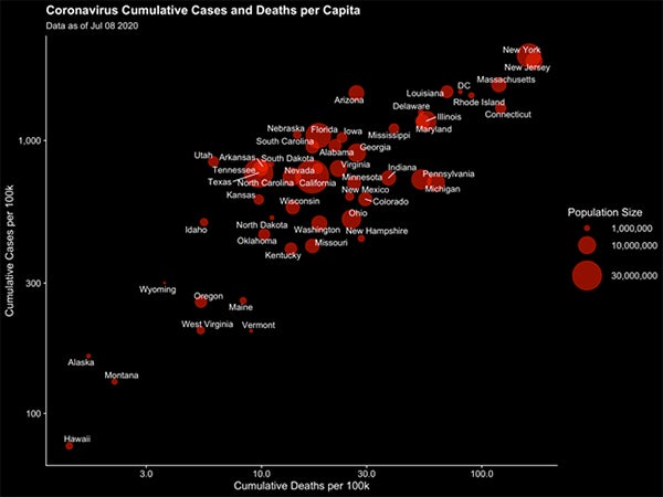
A Harvard Pop Center working paper presents state-level data on COVID-19 cases and deaths (spanning from January 22 until July 8, 2020) in one animated graphic that helps to illustrate the lag time between cases and deaths. The visualization helps to show the relationship between the two metrics, and could be useful to set expectations following a surge (or decrease) in cases.
Novel animated graphic illustrates lag time between COVID-19 cases and deaths in United States