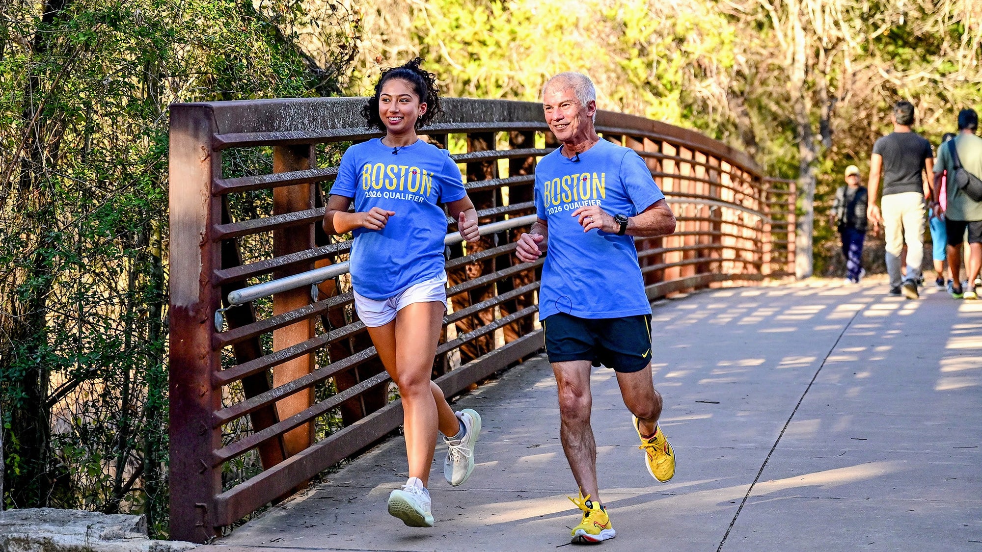
News Home / News Latest News Can humans age healthier? Researchers see promising paths. Aging May 13, 2026 Stay connected with Harvard Chan School The latest public health news delivered right to your inbox. Subscribe to our newsletters Featured Stories In the Media How hantavirus actually spreads is a key question Infectious Diseases May 14, 2026 In the Media Staying safe from wildfire smoke Environment & Climate Health May 13, 2026 Class of 2026 Read more Class of 2026 student stories Meet Chimba Sanga: Zambian physician, public health leader, LinkedIn influencer Global Health May 13, 2026 Why are other kids starving? Food, Nutrition, Diet April 22, 2026 Meet Mia Sanchez: Climate researcher, first-gen student, marathoner Environment & Climate Health April 16, 2026 From Our Students Renata Prôa, MPH ’25, hopes AI can accelerate public health solutions March 25, 2025 Ilahi Creary, MPH ’26, is inspired to serve others through public health March 25, 2025 Carisha Pranyoto, MPH ’27, sees collaboration as the key to a healthier world March 25, 2025 All News