The Harvard T.H. Chan School of Public Health logo is a central element of the school’s visual identity and must appear, at least once, on all School materials produced for external audiences. Please carefully review the logo standards on this site. The Harvard Chan School logo may not be altered or added to.
Lockups
The School’s logo system is comprised of four lockups, horizontal, horizontal alternative, centered, and stacked. Below are previews and links to the official School logos in various formats for print and web. Do not modify or change the logo. The logo is protected by Harvard University copyright.
Links to download files for the School’s logo may be found midway down this page.
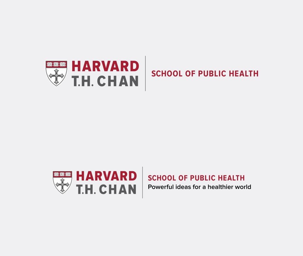
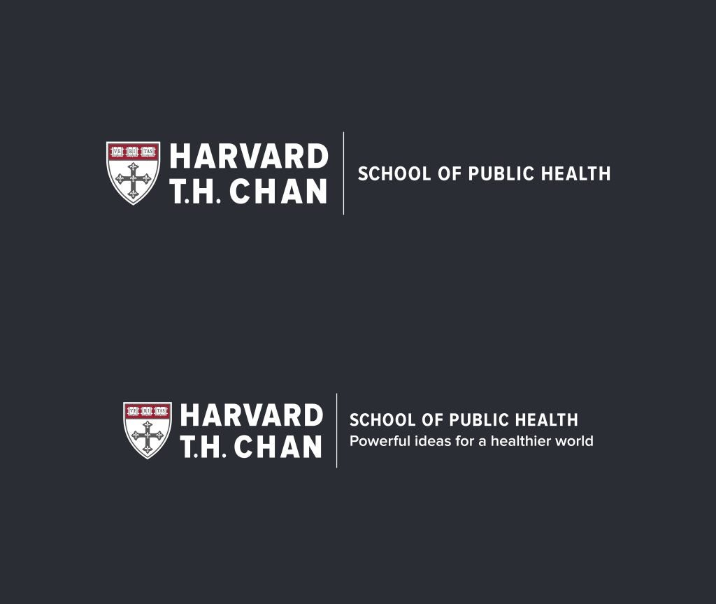
Horizontal
This is the primary lockup for the School. This lockup is ideally used when it appears on its own, not in combination with other logos. This lockup also features a tagline version.
Horizontal Alternative
Use this lockup when space is limited, or when the logo appears alongside other horizontally oriented logos.


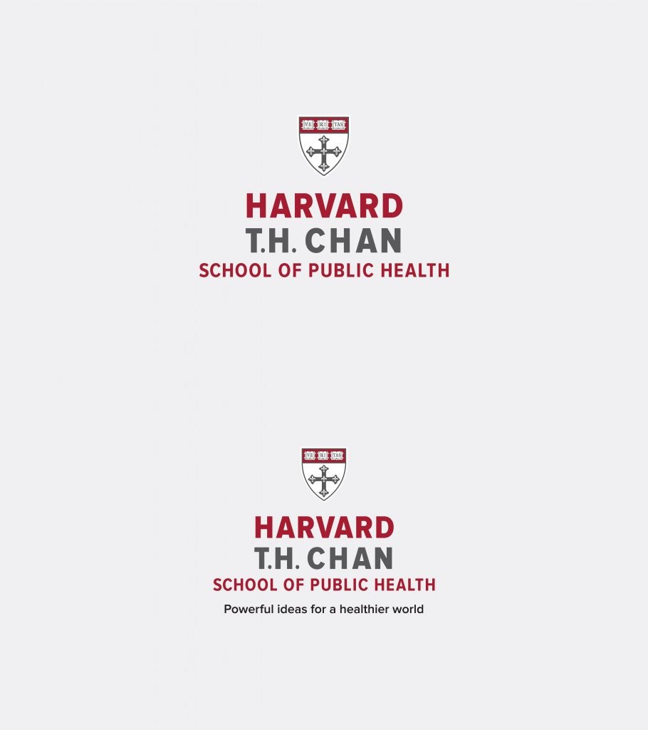
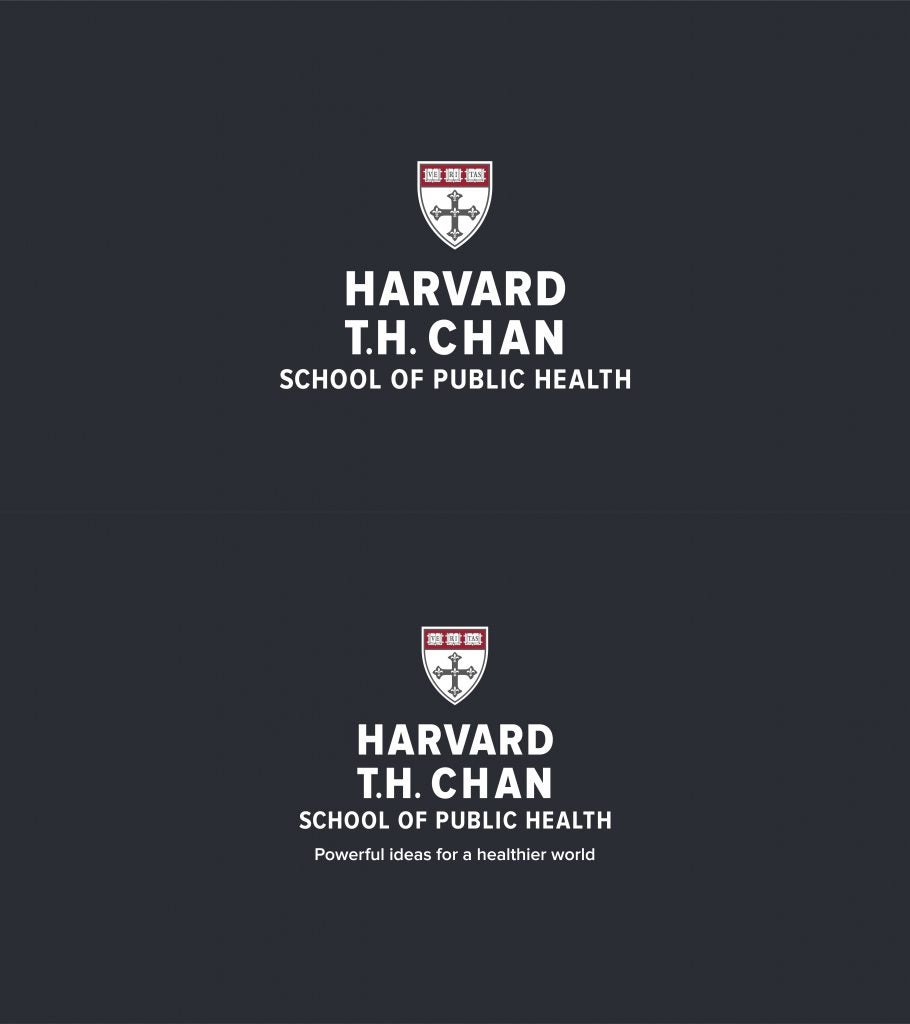
Centered
This lockup works well in traditional applications, such as a printed program or fundraising event invitation. This lockup also features a tagline version. Use this logo when it appears alongside other center-orientation logos.
Stacked
Use this lockup when space is limited, or when the logo appears alongside other stacked orientation logos.


The logos are available in full color, “KO” or knockout (full-color shield with white text for dark backgrounds), and one color (black and white).
For assistance with the School’s logo, or special requests, please contact the office of communications at communications@hsph.harvard.edu
Guidelines
Printing colors
In multi-color print work (i.e. stationery, invitations, business cards), the Harvard T.H. Chan School of Public Health logo is presented using two colors:
- Harvard Crimson (PMS 187 C) for the words “Harvard” and “School of Public Health”
- Harvard Chan Gray (PMS 426 C) for the words “T.H. Chan,” for the vertical bar and for the non-crimson portions of the School’s shield.
- When the logo with tagline is used, the tagline should appear in black.
For more information on colors including the correct formulas to use in different color spaces (i.e., CMYK, Pantone uncoated, and RGB), visit the color section of this guide.
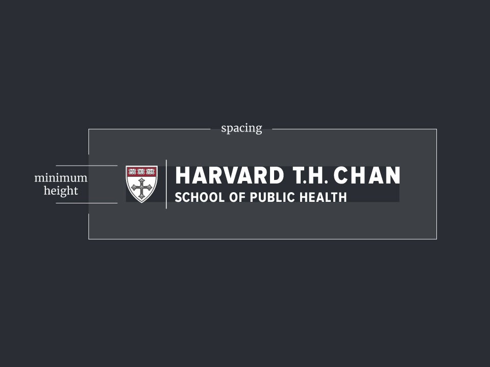
Proper height and clear space
The School’s logo requires specific shield sizing and spacing in relation to its dimensions. Follow these rules to ensure your use has the proper sizing and spacing.
Minimum shield height
Screen, 32 px; Print, 0.333″ (1/3″)
Minimum spacing around
Screen, 32 px; Print, 0.333″ (1/3″)
Match minimum to shield height. This space should remain free of any type or graphic elements.
Cobranding
On occasion, the Harvard Chan School’s logomark will need to appear in tandem with other logos, such as with a partner or supporter. In these cases, the logo configuration you select—horizontal, horizontal alt, centered, or stacked—should appear proportionally similar to the affiliate logo and should be separated with a hairline rule with shield height spacing in between. If the affiliate logo is another Harvard school, match the shield heights to each other as best as possible. Cobranded communications created and deployed by the School should always have the School’s logo appear first.
Cobranding with any non-Harvard entity is prohibited without prior permission from the School and Harvard Trademark Office.

Maintaining the integrity of the logo
Separation
Do not separate the shield or the text from the logo or otherwise present the logo with an element removed. The Office of Communications will occasionally permit the shield to standalone, but this is not to be done without prior approval.
Do not stretch, condense, or distort the logo.

Do not recolor the logo.

Do not selectively scale or change the proportions of any element of the logo.

Do not redraw the logo using another typeface for the wordmark.

Use sufficient contrast when placing the logo over a background image.

Use the correct lockup color (full color, knockout, or one color) for light vs. dark backgrounds

For assistance with the School’s logo, or special requests, please contact the office of communications at communications@hsph.harvard.edu


