Typography guidelines ensure we maximize accessibility and maintain visual hierarchy throughout all of the School’s content, in print and on screen. Using the correct fonts serve as a way of reinforcing brand identity and continuity.
The School’s three primary typefaces, Proxima Nova, Atlante, and Petrona, are selected to create bold, earnest statements and tell the School’s stories effectively. The modern sensibility of Proxima Nova is balanced by the more traditional qualities of Atlante and Petrona.
Note: We have retired the use of Merriweather. While you may still use this font in existing materials, please begin to use Atlante and Petrona for your sans-serif type. For assistance with this transition, or other questions that may arise, contact creative@hsph.harvard.edu.
Each font can be licensed at no cost for both print and web. Proxima Nova can be licensed through Adobe Fonts, Atlante through Adobe Fonts, and Petrona through Google Fonts. System fonts Arial and Georgia (see below) should always be used with Microsoft Word, Powerpoint, Outlook, and other file formats that are likely to be opened on devices and computers that do not have the premium typefaces (Proxima, Atlante, and Petrona) installed.
Specimens
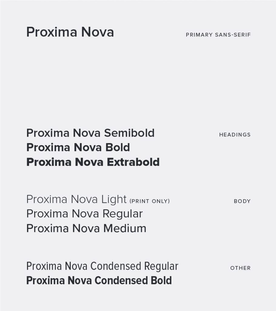
Proxima Nova
Headings
Semibold (font-weight: 600)
Bold (font-weight: 700)
Extrabold (font-weight: 800)
Body
Light (print only)
Regular (font-weight: 400)
Medium (font-weight: 500)
Other
Condensed Regular (font-weight: 400)
Condensed Bold (font-weight: 700)
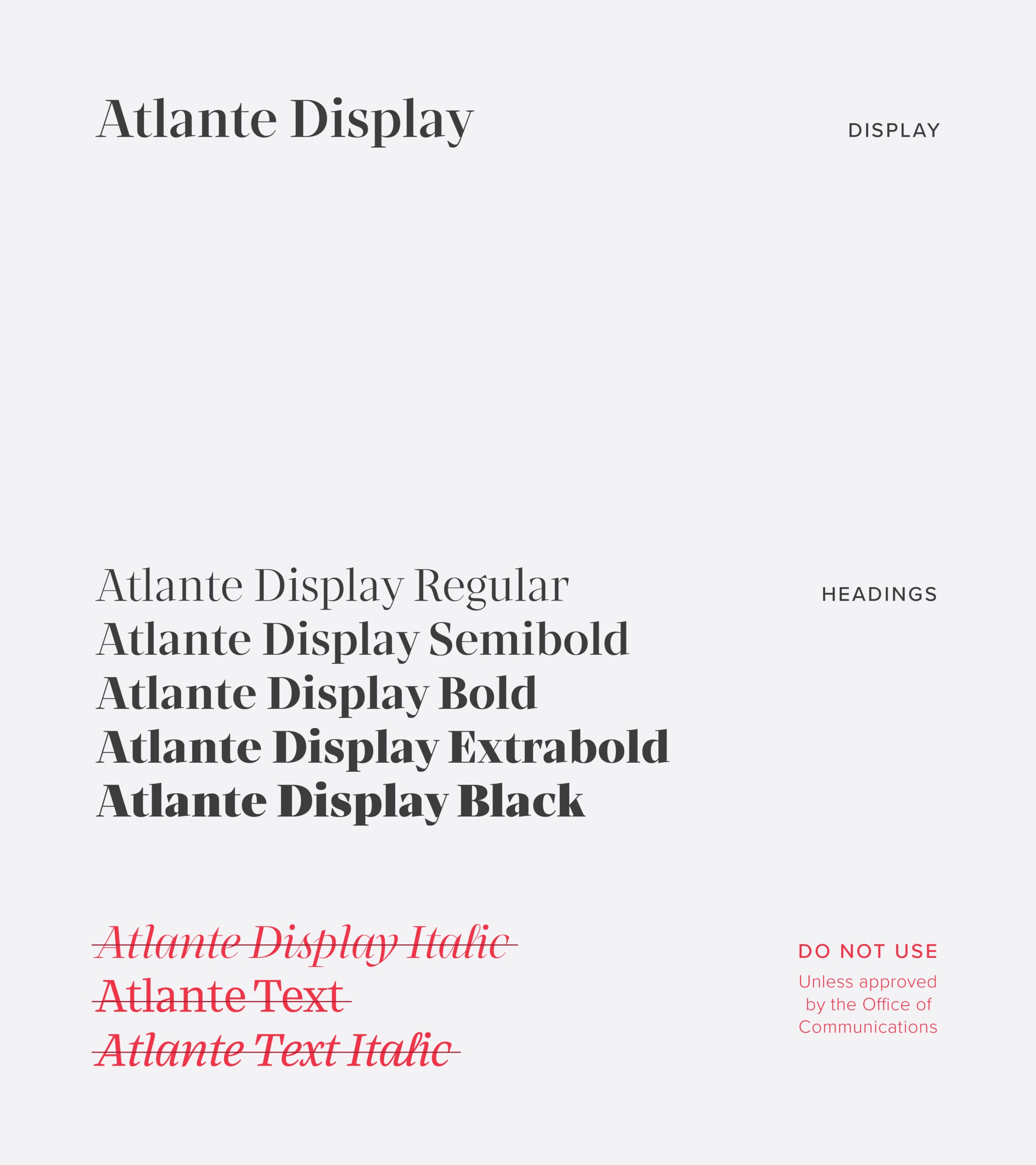
Atlante (replaces Merriweather for headings)
Headings
Regular (font-weight: 400)
Semibold (font-weight: 600)
Bold (font-weight: 700)
Extrabold (font-weight: 800)
Black (font-weight: 900)
Because of the strong stylistic difference between regular and italics for Atlante, we recommend avoiding use of italics with this heading font.
Body
Use Petrona, below, for body sans-serif.
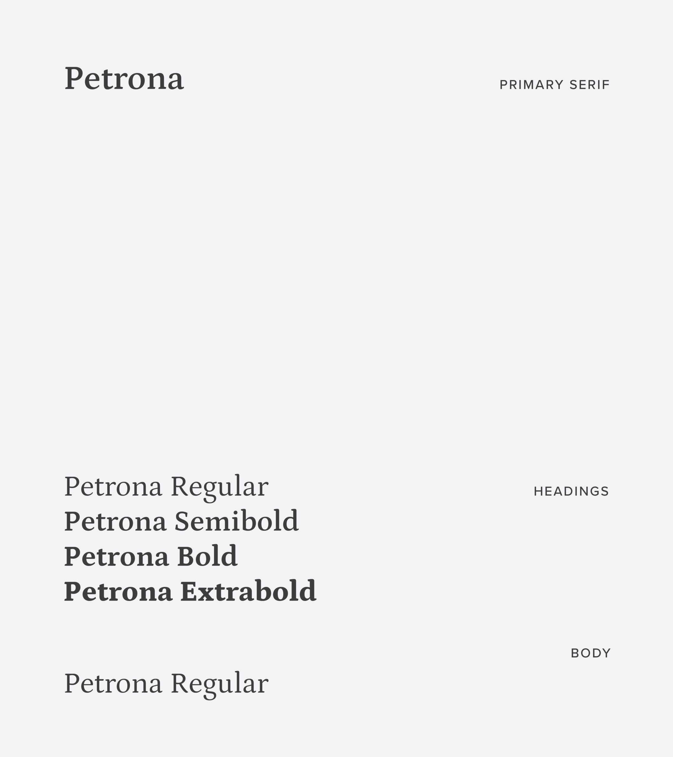
Petrona (replaces Merriweather for body text)
Headings
Atlante or Petrona may be used for headings, for Petrona:
Regular (font-weight: 400)
Semibold (font-weight: 600)
Bold (font-weight: 700)
Extrabold (font-weight: 800)
Body
Regular (font-weight: 400)
System alternatives
When to avoid using Proxima Nova or Merriweather?
System fonts should always be used with MS Word, PowerPoint, and other file formats that are likely to be opened on devices and computers that do not have the premium typefaces (Proxima and Merriweather) installed.
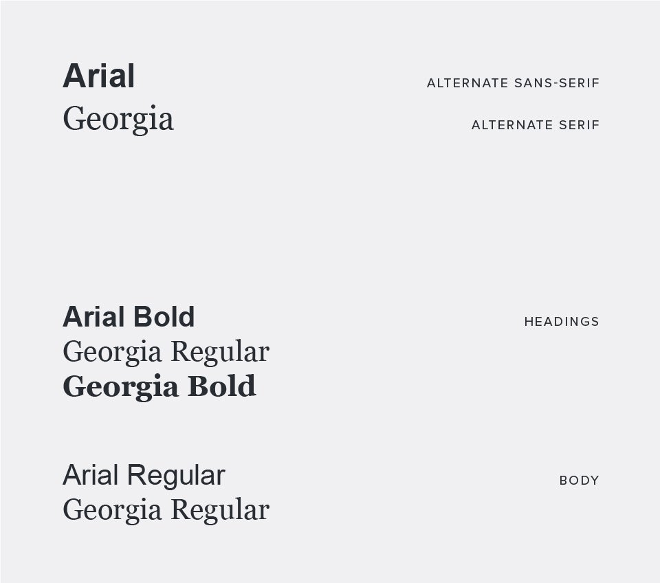
Guidelines
In print
Use Proxima Nova or Merriweather for headlines or any content that needs special attention. Either typeface may also be used for body text, but it’s recommended to stick to one once you’ve made a choice for visual stability. Subheads, sidebars, and callouts can be typeset at your discretion.
On screen
Proxima Nova should be used for headings and Merriweather or Proxima Nova may be used for paragraph text. Please avoid the light-weight styles of Proxima Nova as they have legibility issues on screen.
Examples